Trapped in Suburbia create brands that capture an essence and embody it in unique design. Brands that efficiently and appropriately communicate. Whether flexible, dynamic or sustainable an identity becomes actual rather than only a representation. Brands that are the stories they tell. This is branding that encapsulates your message in an experience, both digital and physical.

Wolterinck

Wolterinck is a high-end design agency in the fields of architecture, interior, styling, art, gardens and products. Total concepts and a lot of attention for the relationship between inside and outside make Wolterinck unique in its kind.

Wolterinck asked for a complete restyling of their branding, including a design for a remarkable coffee table book. Their high quality and the use of natural materials were the starting point for our design in order to connect seamlessly with the extraordinary Wolterinck style.

Scenic Biotech

Scenic Biotech are pioneers in identifying genetic modifiers, which are genes that suppress or completely block the effect of a pathogenic mutated gene. They have now been able to map this for more than a dozen hereditary diseases, bringing the treatment of these diseases one step closer.

Scenic Biotech is a company with a creative pioneer mentality and the branding fits in seamlessly with this. The branding system we have devised is extremely flexible and colourful in approach. Inspired by the quest for genetic modifiers, we zoom in on the Scenic Biotech logo. This results in playful shapes with endless possibilities.

Forty

Forty supports companies by creating a culture where employees have a real sense of belonging. Where they excel at what they do, and where they positively impact the business and community they are a part of.

The name Forty comes from the song ’40’ by the band U2. It refers to psalm 40, ‘I will sing, sing a new song’. With a new name, of course, there had to be a catchy identity that clearly shows that Forty is there especially for you.

Graphic Matters 2

Graphic Matters is a biennial graphic design festival in Breda that shows how designers can shape and influence people’s perspective on current issues.

The 2019 theme was Information Superpower. From visual statistics to interactive data visualization; designers use their super powers to make the world transparent. Automatically generated graphs and bar charts are no longer sufficient. Designers, together with programmers, journalists and researchers, develop new ways of imagining complex situations, mountains of data and complicated systems.

Photography by: Edwin Wiekens/ Rosa Meininger / Almichael Fraay

Just Peace

justpeacethehague.com


Trapped in Suburbia award

Gold | 2015 International Design Award

Driiip

Three circles in the Driiip identity represent the stages and elements to drip irrigation – water, life and earth. Drip irrigation is an extremely precise and water conserving method of irrigation which slowly releases droplets of water directly to the root over a long period.

These three elements return throughout the identity in graphic illustrations of the process and photography of luscious greenery. Placement of these also play with the physicality of materials such as earth that lies on the bottom of the letterhead.


Trapped in Suburbia award

Bronze | 2016 Hiii Brand Awards

Fresh Tracks Europe

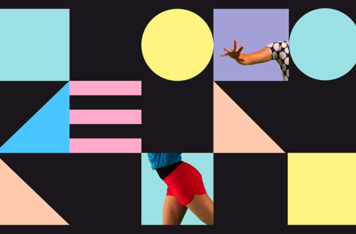
Fresh Tracks Europe is a youth dance network for a new generation of choreographers. Their identity is based on a set of dancing body parts and coloured shapes. Dancers from the various groups actually become part of their own identity.

These building blocks form an identity with lots of room to play. The blocks symbolise the philosophy of Fresh Tracks Europe in which the different European dance groups work together to create a new dance generation.

The flexibility in the design means the identity is dynamic it has rhythm and movement. The identity itself can dance.


Trapped in Suburbia award
Silver | 2012 European Design Awards
Silver | 2012 International Design Awards
Finalist | 2013 Hiiibrand Design Award

Develops

Turning waste into identity.

Develops, a company that turns ideas into a reality, uses flip-over charts to sketch and explain processes to their clients. A used chart is then cut into the various parts that form the identity: letterheads, business cards, notepads and envelopes. Simple, no big print costs and it gives use to waste material.

Consequently, Develops creates its own identity and every element becomes unique. People don’t experience a representation of their process but the real thing and always the actual flip-over paper.

develops.nl

Hague Talks

Hague Talks is an international travelling meeting place for creative minds, peace inventors and game changers in the field of peace and justice.

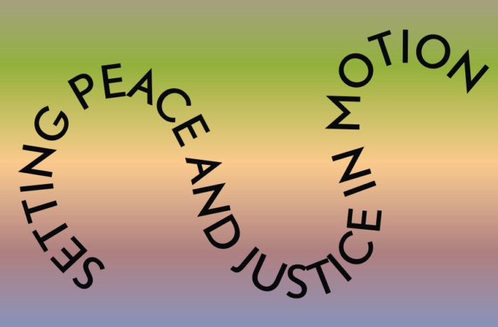
The first Hague Talks event took place at the Peace Palace in The Hague and future events will travel to New York, South Africa and further. For each location the colour scheme is created from the prominent colours of that particular place. Therefore, each location has its own identity.

The logo represents the start of the peace process and the chain reaction that follows. This chain reaction is also translated into the moving typography which can be found throughout the whole identity.

Hague Talks is a stage and breeding place for new ideas and perspectives, a forum for discussion and a starting point for concrete action. It is the platform that sets the ball rolling on the idea of gaining peace and justice.

haguetalks.com


Trapped in Suburbia award
Bronze | 2015 Hiiibrand Awards