Wolterinck

Wolterinck is a high-end design agency in the fields of architecture, interior, styling, art, gardens and products. Total concepts and a lot of attention for the relationship between inside and outside make Wolterinck unique in its kind.

Wolterinck asked for a complete restyling of their branding, including a design for a remarkable coffee table book. Their high quality and the use of natural materials were the starting point for our design in order to connect seamlessly with the extraordinary Wolterinck style.

Forty

Forty supports companies by creating a culture where employees have a real sense of belonging. Where they excel at what they do, and where they positively impact the business and community they are a part of.

The name Forty comes from the song ’40’ by the band U2. It refers to psalm 40, ‘I will sing, sing a new song’. With a new name, of course, there had to be a catchy identity that clearly shows that Forty is there especially for you.

Develops

Turning waste into identity.

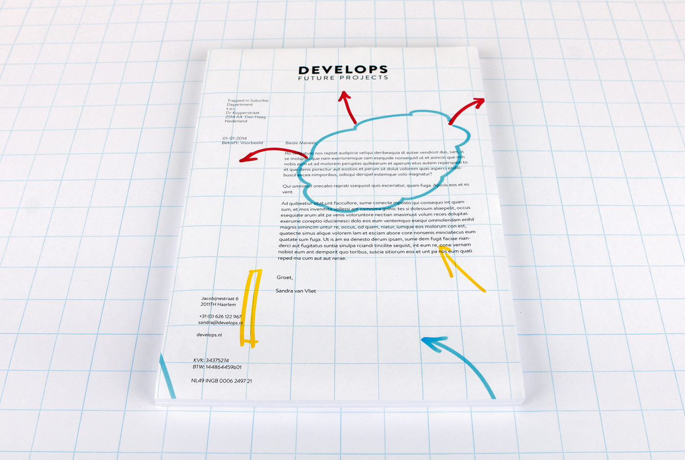
Develops, a company that turns ideas into a reality, uses flip-over charts to sketch and explain processes to their clients. A used chart is then cut into the various parts that form the identity: letterheads, business cards, notepads and envelopes. Simple, no big print costs and it gives use to waste material.

Consequently, Develops creates its own identity and every element becomes unique. People don’t experience a representation of their process but the real thing and always the actual flip-over paper.

develops.nl

Hague Talks

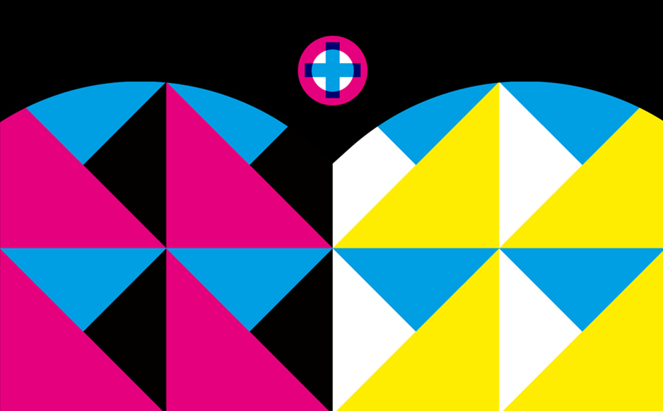
Hague Talks is an international travelling meeting place for creative minds, peace inventors and game changers in the field of peace and justice.

The first Hague Talks event took place at the Peace Palace in The Hague and future events will travel to New York, South Africa and further. For each location the colour scheme is created from the prominent colours of that particular place. Therefore, each location has its own identity.

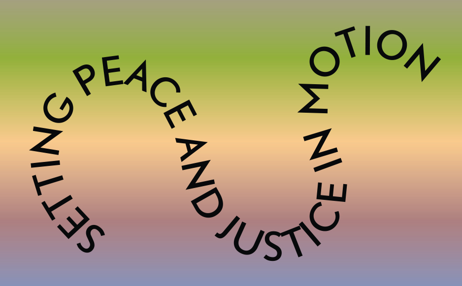
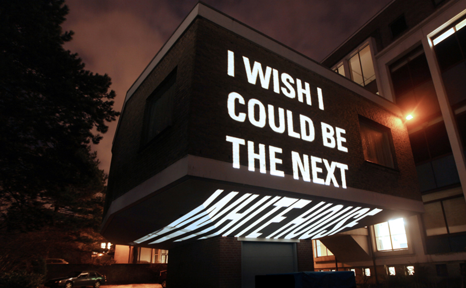
The logo represents the start of the peace process and the chain reaction that follows. This chain reaction is also translated into the moving typography which can be found throughout the whole identity.

Hague Talks is a stage and breeding place for new ideas and perspectives, a forum for discussion and a starting point for concrete action. It is the platform that sets the ball rolling on the idea of gaining peace and justice.

haguetalks.com


Trapped in Suburbia award
Bronze | 2015 Hiiibrand Awards

Escamp

This city lab is a multipurpose talent centre in the Escamp neighbourhood of The Hague. Not only does this design brand the lab but in turn creates an identity for the complete neighbourhood.

Community and togetherness are the foundations of the Escamp identity. The lab was established to break down cultural barriers between and unite different groups living in the neighbourhood. Activities focused around: art, design, media, technology and global cuisine attempt to build a sense of team spirit in the area.

A sports team offers camaraderie and transcends differences just as Escamp wished to achieve. Therefore, the identity uses a bold and unique colour scheme, like a football strip, to build a recognisable brand. This main aspect is then flexible to adapt to illustration, campaigns, signage, stationary and so on.

The identity also plays with the word ‘Escamp’ to highlight the variety of activities on offer at the city lab.

Love Life Festival

Love Life Festival was organised to raise safe sex awareness amongst younger inhabitants of The Hague. The campaign’s strong visual identity places the heart as the most important role. The heart symbolises two people having sex, becoming one, but remaining separate by protecting themselves. Aids and other STDs effect all sorts of people, no matter their social background or sexual preferences. Consequently, the colour scheme is free from associations, only the reference to nightlife where the majority of the target audience is found.

Visuals are accompanied by witty short copy provoking visitors to smile but also think about the important subject. This is a different and new approach to bringing the message of safe sex because merely scaring people just does not work. Humour can help discuss these tricky subjects. For instance, a tram that reads “Take me, take me now!”, toilet stickers that read “Make me wet”, crew shirts that read “(s)crew” or for the bar crew “I can make you come twice”, mirror stickers that read “Mirror, mirror on the wall, who is the sexiest of them all?”, free cards that scream “Take me!” and promotion teams with billboards that display “If you like my back, you should check the front”.

The festival also included the One Night Stand Up Comedy and a dance event called I’m Gonna Make You Sweat.

Wie is de nar?

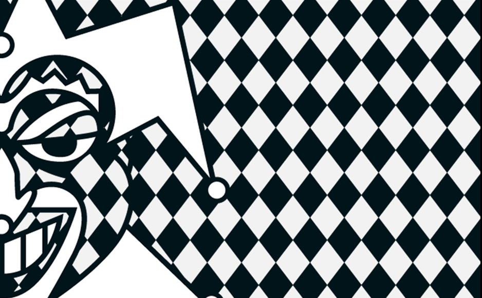
Wie is de nar? (Who is the Fool?) is a festival drawing attention to the importance of the Theater Instituut Nederland (Dutch Theatre Institute). Due to budget cuts, the institute had to make themselves noticed and to do so organised this festival.

The identity is limited to black and white. Not only does this stand out in between all the colourful imagery saturating the streets, it also symbolises the cultural poverty due to the budget cuts. To amplify this, the fool possesses a sinister grin. Inevitably though, from these cuts the cultural scene will grow back stronger.

Wie is de nar? – Spelen met de macht (Who is the fool? – Playing with the power) shows how the role of the fool, or jester, has changed throughout time, both in theatre and every day life. Wie is de nar? attempts to capture the role that the fool plays. Exhibitions, performances (on the street and in the theatre) and debates were all part of the festival.


Trapped in Suburbia award
Finalist | 2013 European Design Awards
Merit | 2013 Hiiibrand Design Award

Just Peace

justpeacethehague.com


Trapped in Suburbia award

Gold | 2015 International Design Award

Fresh Tracks Europe

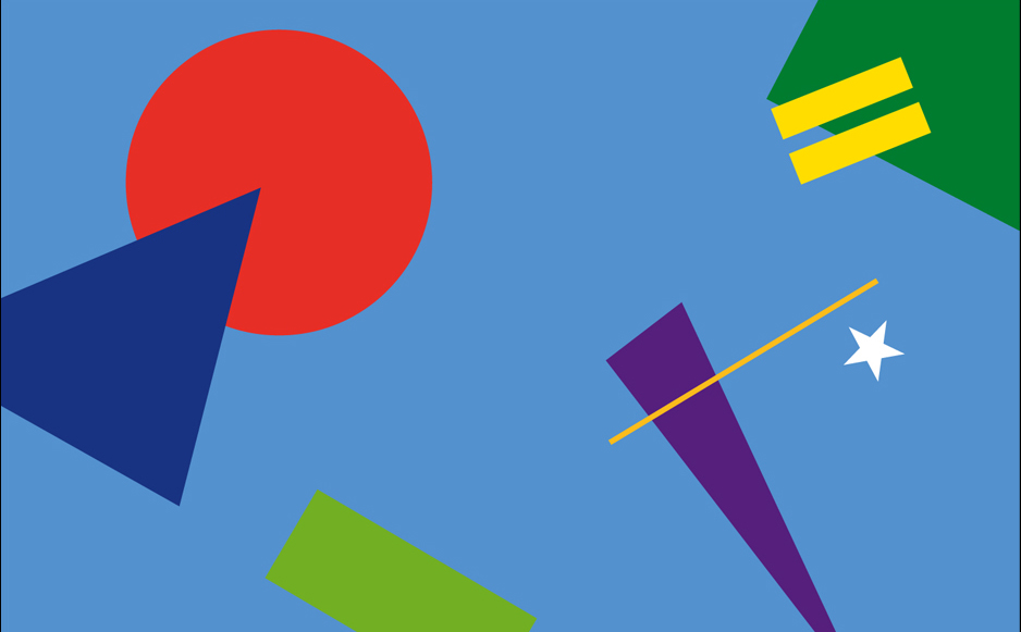
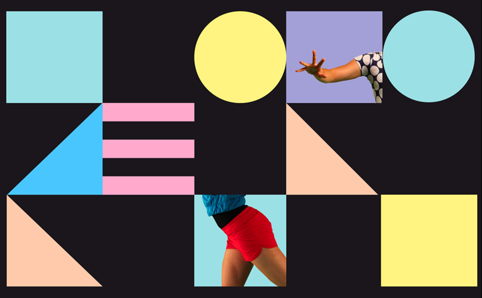
Fresh Tracks Europe is a youth dance network for a new generation of choreographers. Their identity is based on a set of dancing body parts and coloured shapes. Dancers from the various groups actually become part of their own identity.

These building blocks form an identity with lots of room to play. The blocks symbolise the philosophy of Fresh Tracks Europe in which the different European dance groups work together to create a new dance generation.

The flexibility in the design means the identity is dynamic it has rhythm and movement. The identity itself can dance.


Trapped in Suburbia award
Silver | 2012 European Design Awards
Silver | 2012 International Design Awards
Finalist | 2013 Hiiibrand Design Award

Driiip

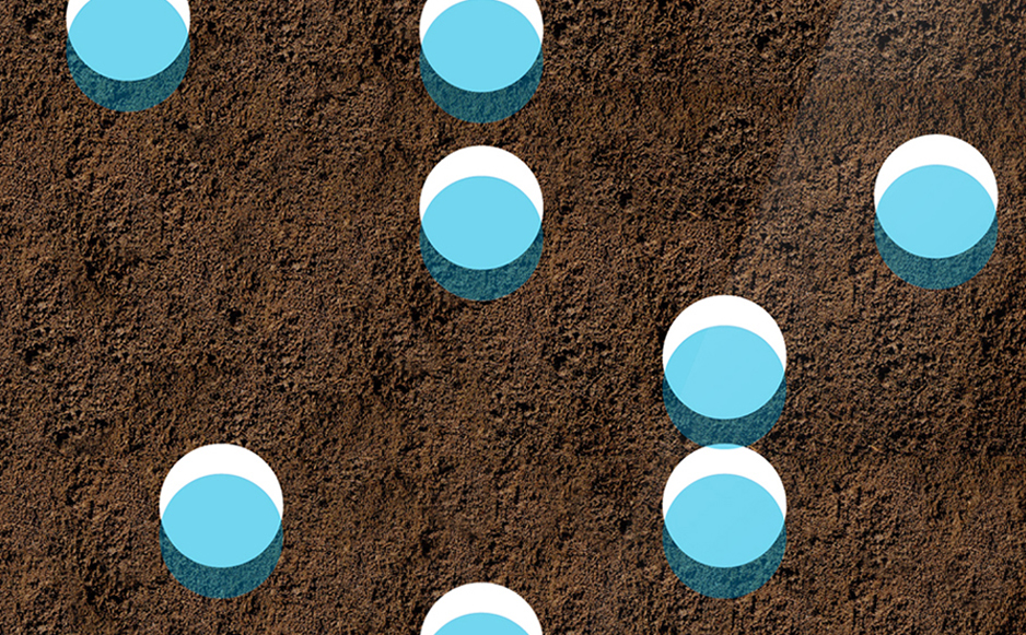
Three circles in the Driiip identity represent the stages and elements to drip irrigation – water, life and earth. Drip irrigation is an extremely precise and water conserving method of irrigation which slowly releases droplets of water directly to the root over a long period.

These three elements return throughout the identity in graphic illustrations of the process and photography of luscious greenery. Placement of these also play with the physicality of materials such as earth that lies on the bottom of the letterhead.


Trapped in Suburbia award

Bronze | 2016 Hiii Brand Awards