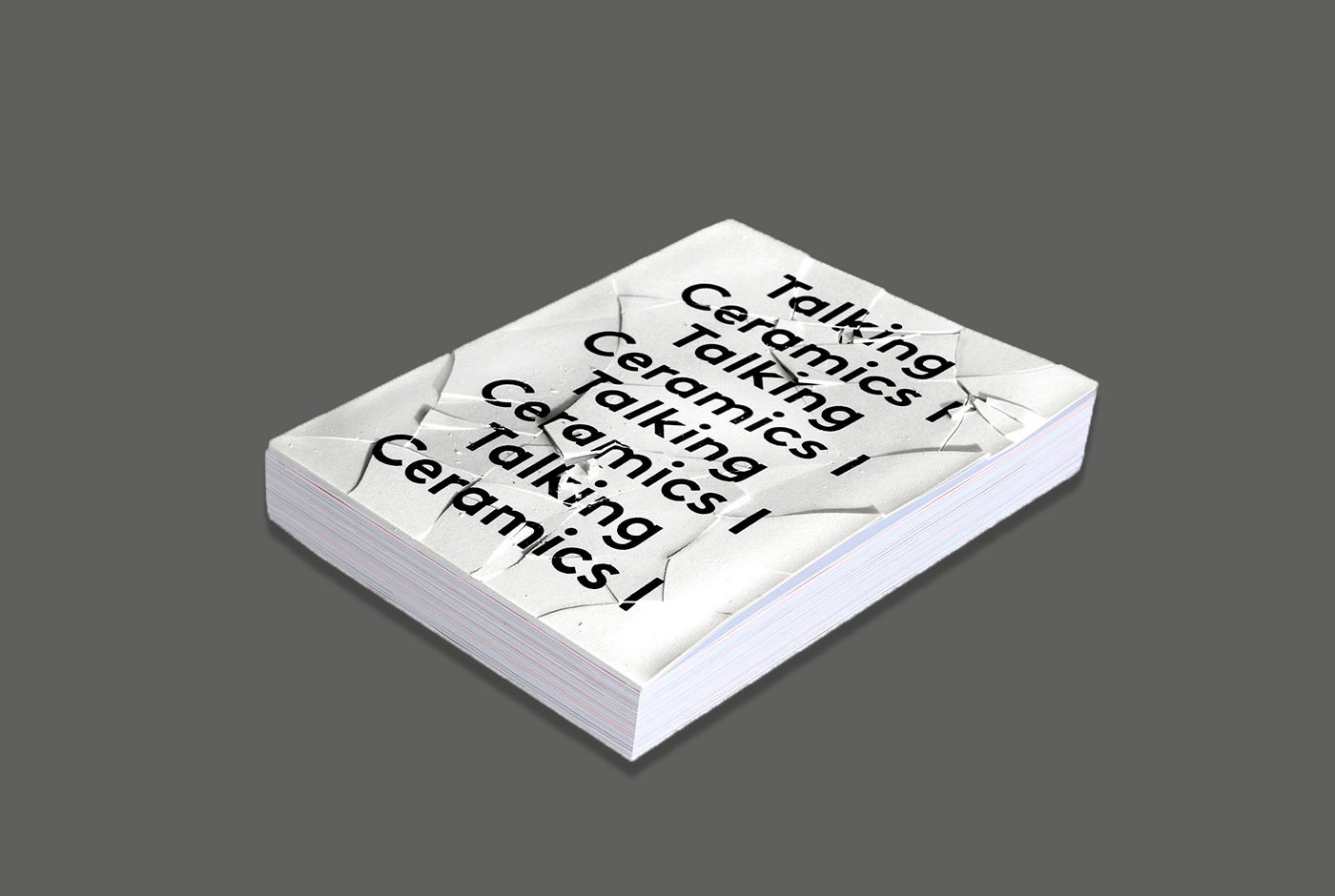
Arita Ceramics Symposium
The Arita Ceramics Symposium was held in November 2016 in Arita in Japan. Arita ware is one of Japans most famous ceramics and rich in tradition. This book is the transcript of the symposium and is a gift for the speakers and organizers. During the 2 days lots of valuable information on ceramics is shared between different cultures and this is not be be lost.
The brief was to design a book that shows the full transcript of the symposium in both English and Japanese and turn this into something special and a collectors item.
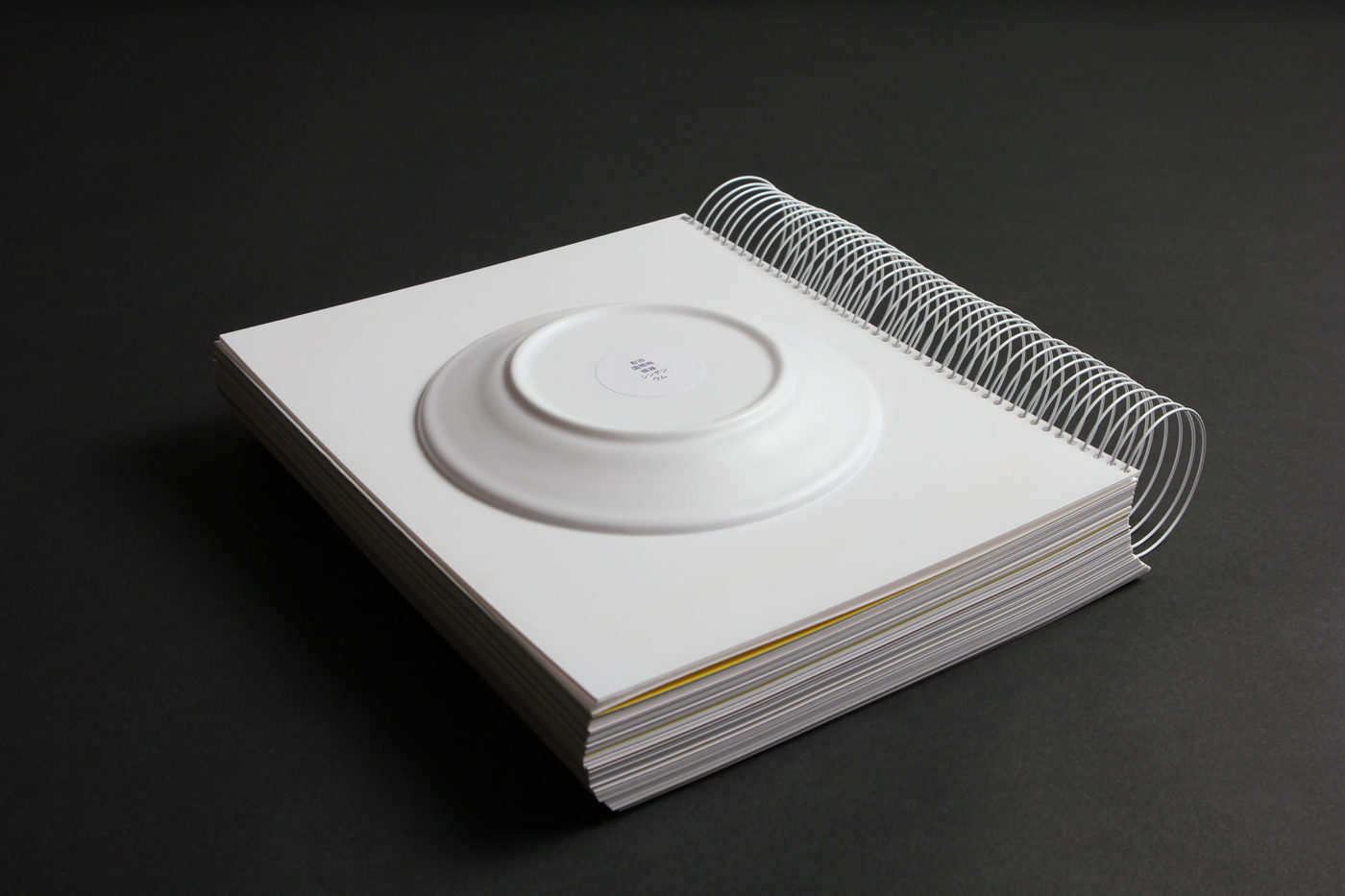
The essence of the symposium is Ceramics. Therefore we chose to have a ceramic platter on the cover of the book. On the front cover the is the image of the ceramic platter, this represents the talking about ceramics. And on the back we have a 3D moulded Arita ware platter, which represents the actual making of the ceramics. This also makes the book float when you lay it on the table and keeps the big wiro- spine elevated.
The inside contains different grams of paper from 300 grams on the outsides it slowly transforms from 280, 260, etc into lighter paper 80 grams on the heart of the book. The represents the different possibilities of ceramics. It can be really thick and strong, but also fragile and transparent.
Because of almost 400 pages there was no wire-o available to bind the book and this had to be custom made by hand by the binder. This book is the first of it’s kind with such a big wire-o.
All the above and the run of just 35 copies makes the book a unique design and a collectors item.
![]()