VPRO Annual Review

The theme of this VPRO annual review 2019 is Future Builders. Shaping and wanting to help build the future is a fixed value in the stories and programs of the VPRO. During the Dutch Design Week, VPRO already collected future questions from the public. Questions that VPRO should work with, whether for research or otherwise. It yielded them many hundreds of responses, written on large colored cards.

These cards were the inspiration for the design of the annual overview. Not a bound book, but a stubborn box with loose cards. With a bit of a nod to the old-fashioned videotape. The first card is a blank card for members to send their own future question to the VPRO.

Laboratory Rembrandt

In the exhibition Laboratory Rembrandt; Rembrandt’s technique unraveled, visitors step into the shoes of the scientists. Think about the dilemmas of researchers and conservators. All this in the place where Rembrandt created his artworks almost 400 years ago at the Rembrandt House museum.

Rembrandt’s former studio was specially transformed into a laboratory-like setting, in which the new insights and secrets of the master are revealed step by step. The Rembrandt Laboratory is not an exhibition where you just look, it is an exhibition where you really have to work! This exhibition is for everyone, young visitors from the age of 6 receive a special clipboard with a research kit. On the basis of questions and assignments you will investigate the exhibition yourself.

Additional photos by Billie-Jo Krul

Arita Ceramics Symposium

The Arita Ceramics Symposium was held in November 2016 in Arita in Japan. Arita ware is one of Japans most famous ceramics and rich in tradition. This book is the transcript of the symposium and is a gift for the speakers and organizers. During the 2 days lots of valuable information on ceramics is shared between different cultures and this is not be be lost.

The brief was to design a book that shows the full transcript of the symposium in both English and Japanese and turn this into something special and a collectors item.

The essence of the symposium is Ceramics. Therefore we chose to have a ceramic platter on the cover of the book. On the front cover the is the image of the ceramic platter, this represents the talking about ceramics. And on the back we have a 3D moulded Arita ware platter, which represents the actual making of the ceramics. This also makes the book float when you lay it on the table and keeps the big wiro- spine elevated.

The inside contains different grams of paper from 300 grams on the outsides it slowly transforms from 280, 260, etc into lighter paper 80 grams on the heart of the book. The represents the different possibilities of ceramics. It can be really thick and strong, but also fragile and transparent.

Because of almost 400 pages there was no wire-o available to bind the book and this had to be custom made by hand by the binder. This book is the first of it’s kind with such a big wire-o.
All the above and the run of just 35 copies makes the book a unique design and a collectors item.


Trapped in Suburbia award

Silver | European Design Awards

Sound Posters

Initiated from the studio’s background in traditional print design and interest in new emerging technology, the Sound Posters are an ongoing research into creating new levels of interaction within the medium of the poster.

Stemming from the desire to involve people more and create new, exciting and memorable experiences, the Sound Posters push the boundaries of conventional print design. The inquiry re-appropriates both new and old technology for different and inventive applications to enhance the poster yet keep it close to its acknowledged form.

Aside from investigating the possibilities, the posters present future developments that combat the argument that ‘print is dead’.

With thanks to David van Gemeren, Alice Stewart, Jiawei van Kleef & Rachel Rosenson.


Trapped in Suburbia award

Silver | 2014 European Design Awards

Shy Poster

Expanding the Sound Poster series, the Shy Poster furthers this inquiry into new experiences with the traditional poster medium.

This time the poster gains personality by personifying shyness in an interactive installation. If the poster is left alone its colourful inner character is revealed. However, if someone interrupts this personal comfort zone the poster immediately retracts its doors hiding itself within the conformity of its background.

Providing the new visitor is patient and tactful, the Shy Poster will become comfortable and slowly reveal its true personality. Yet, you must be careful…

Any large movements are detected by motion sensors which trigger the doors to slam shut!

With special thanks to Alice Stewart and Jiawei van Kleef.

Decoding Design

The theme for the Graphic Design Festival Breda 2011 poster exhibition was decoding design. In essence the design process is about making choices. Sometimes though, after putting in a lot of work, you decide to change a design and then come to the conclusion that the initial design worked better. This poster captures that feeling.

Initially, the poster shows a large silver square of scratch-off ink. Prompting people to scratch the ink, text appears from the edges of the square. After taking time to scratch off all the ink the poster reveals: “I think I like it better with the silver square.”


Trapped in Suburbia award

Red Dot Award | 2011 Red Dot Design Award
Short listed | 2011 D&AD award

Hague Talks

Hague Talks is an international travelling meeting place for creative minds, peace inventors and game changers in the field of peace and justice.

The first Hague Talks event took place at the Peace Palace in The Hague and future events will travel to New York, South Africa and further. For each location the colour scheme is created from the prominent colours of that particular place. Therefore, each location has its own identity.

The logo represents the start of the peace process and the chain reaction that follows. This chain reaction is also translated into the moving typography which can be found throughout the whole identity.

Hague Talks is a stage and breeding place for new ideas and perspectives, a forum for discussion and a starting point for concrete action. It is the platform that sets the ball rolling on the idea of gaining peace and justice.

haguetalks.com


Trapped in Suburbia award
Bronze | 2015 Hiiibrand Awards

Hebbes!

Museum Gouda was one of the few museums in the world to take the first steps towards liberating their historic collections as 3D scans for all to view. Hebbes! (Gotcha) is a space within the museum dedicated to presenting the now digitalised collection.

A display inside the room allows the visitor to select an item from the collection. Then using a small cube the visitor can rotate the scanned item to view it in 360° on a large 3D holographic screen.

Auto Play

This interactive installation part of Graphic Design Festival Breda 2015 is a series of Sound Posters that respond to passing movement. Displayed in the 3sec.gallery, an exhibition space along the entrance of a parking garage, the viewer can have only three seconds to drive past and view the posters.

Each of the twenty-five posters react to passing cars, cyclists and pedestrians producing individual sound bites that when heard together form a composition. In collaboration with Koen Herfst (drummer to Armin van Buuren among others) this installation forms an experimental interplay between analogue and digital, picture and sound.

Medieval basement

The redesign of this medieval exhibit in Museum Gouda focused on capturing the imagination and curiosity children had when entering but also making it exciting and informative. Translating all the information into UV illustrations means that to the naked eye nothing is visible. Only with the use of a UV torch can the visitor explore the space and discover facts and stories about the equipment hidden all over the floor. Shining a light on the dark history of the middle ages. Thus placing the visitor in the mindset of this curious, imaginative child and forcing them to search around.


Trapped in Suburbia award

Gold | European Design Awards
Silver | International Design Awards

Jaap Drupsteen – Designer | Explorer

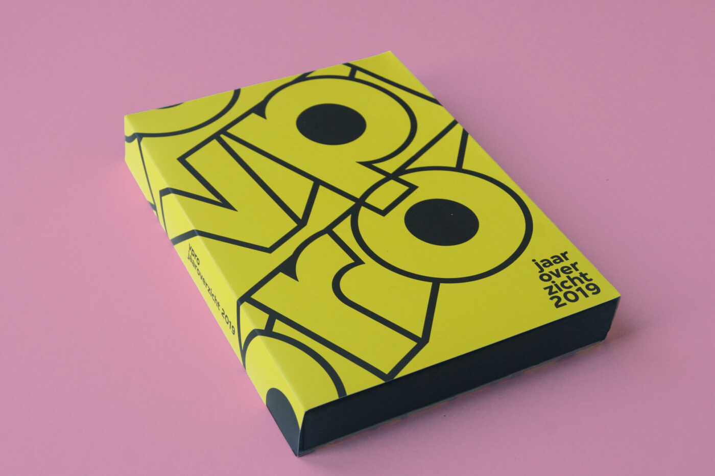
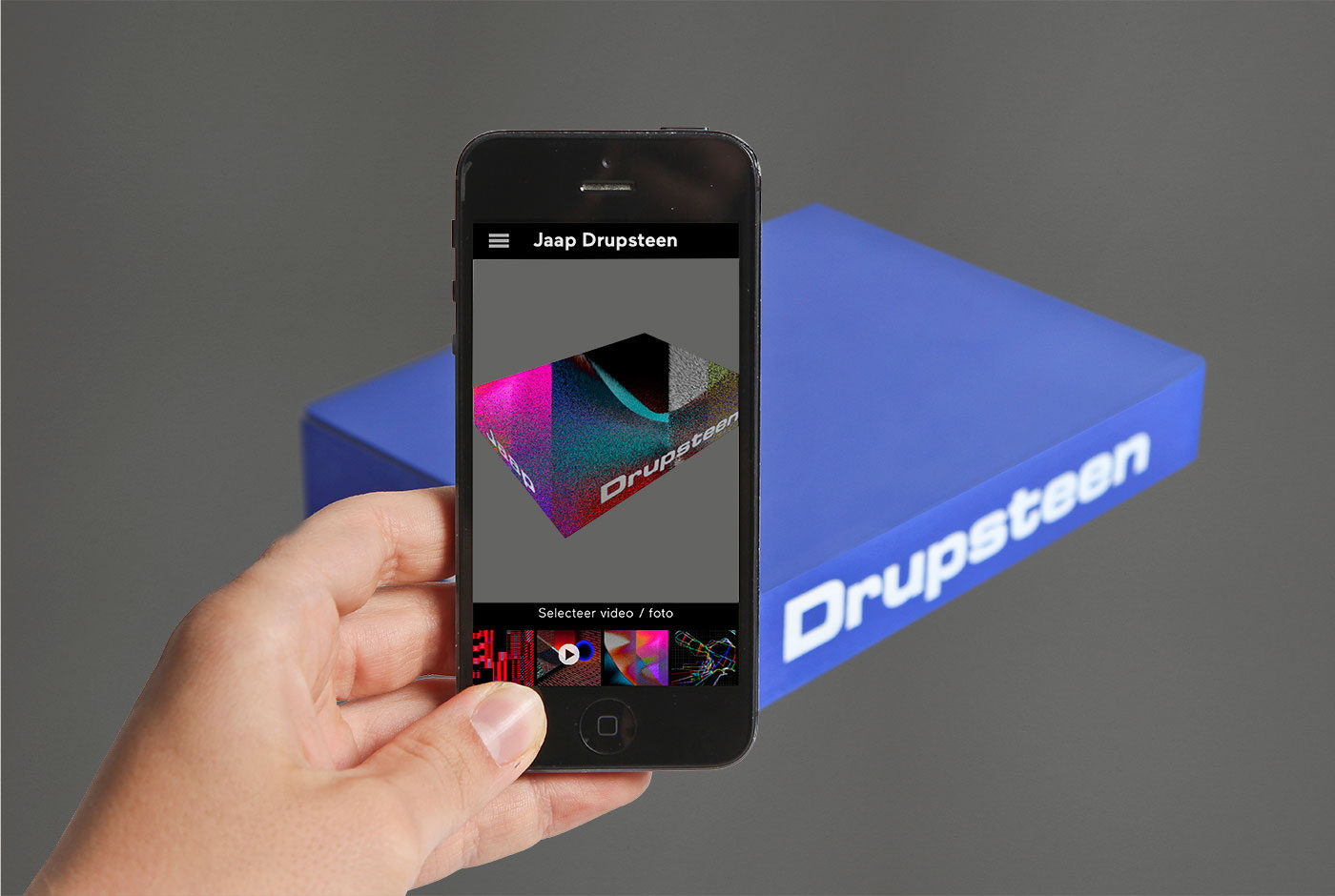
To celebrate fifty-years as a practicing designer, Museum Hilversum held a retrospective exhibition on the work of Jaap Drupsteen. The exhibition showcases Jaap Drupsteen fruitful career and divides this into three sections.

The top floor presents his early audiovisual design (VPRO, Hadimassa etc) and printed objects (money, passport etc). Being a designer for screen, Drupsteen naturally starts working on black, hence the visitor enters a completely black space displaying only video work. After this the visitors moves to white – print work. Also on show are the original title rolls, all made by hand, inspiring a scrolling intro wall.

Since the exhibition features a large amount of video work a special audio system, the Sennheiser guidePORT, is used.  With the headphones on the user walks towards a screen or into a particular area and the audio is automatically heard. This prevents multiple audio tracks clashing and turning the exhibition space into musical chaos.

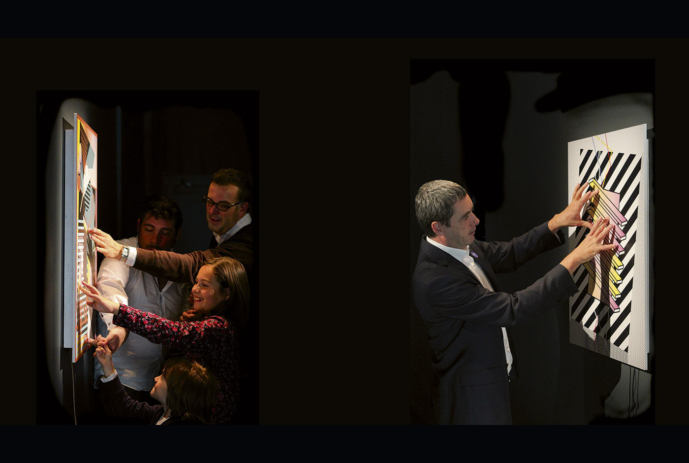
The Music Theatre is the second floor and displays many of Drupsteen’s theatre productions he created specifically for television. To create these unusual and inventive productions he became revolutionary in his use of chroma keying – the blue/green screen effect. To demonstrate this the visitor can experience live chroma keying by standing in a blue screen area and magically being positioned into one of Drupsteen’s works.

The lower floor presents his most recent work through two large scale projections. These are audiovisual compositions created for DJ and orchestral visuals and use a software developed by Drupsteen himself to achieve a perfect sync between image and sound.

Graphic Happiness – 100 Years of Dutch Graphic Design

Graphic Happiness consists of a publication, traveling exhibition and educational programme covering 100 years of Dutch graphic design. Travelling through China the exhibition showed work of over 60 designers highlighting their love of design.

A key part of the exhibition is the ball pit, which symbolises that the Netherlands lies below sea level. Due to the historic struggle with water, the Dutch had to be extremely inventive for hundreds of centuries. They had to design their environment in order to survive. From this necessity comes the Dutch theory that everything can be designed and forms the base to the distinctive, playful and clear Dutch design that is world-renowned. Each blue ball shows a portrait of a legendary Dutch designer or one of their designs so you can literally dive into Dutch design history.

The exhibition shows the work of over 60 designers and shows their love and passion for graphic design. Design is what makes these designers happy. It also bring the two countries, China and the Netherlands together, in an exchange of design knowledge and culture.

Based on the Chinese symbol of ‘double happiness’ and the Dutch flag (red, white and blue) the logo symbolises the two countries uniting in design. The logo is divided and produced as three different straps, which hold together the exhibition furniture and bind the publication. The logo is literally and metaphorically the binding factor in the whole design.

The flat pack furniture construction in combination with the strap fixtures provided an easily assembled solution for a travelling exhibit.


Trapped in Suburbia award
2x Silver | International Design Awards
Brons | International Design Awards
Bronze | Hiiibrand Design Award

Design it Yourself

Design It Yourself is an interactive exhibition at the former Graphic Design museum in Breda. In the exhibition both children and adults are challenged to work as designers by the use of large moving blocks. There are different elements for them to design such as: a magazine cover, a stop motion animation, a T-shirt or an icon.

Trapped in Suburbia award

Silver | International Design Awards
Finalist | European Design Awards

Room to play


Ruimte voor de spelende mens (Room to play) presents The Hague’s dream to become a utopian city based on artist Constant Nieuwenhuys’ New Babylon. Here the city is an environment where its inhabitants can focus solely on their creativity and exist as homo ludens, ‘playing man’.

This financial report documents the cultural budget distribution across the many institutions in The Hague. The document details the government’s spending for the following four years in comparison to previous.

Fulfilling the city’s dream, the design of the report actually gives the reader the opportunity to play. The content is divided into seven books which form a tangram puzzle. ‘Alles moet mogelijk blijven, alles moet kunnen gebeuren’ (Everything must remain possible, everything can happen), the report’s ethos, is emphasised through the tangram’s ability to form infinite combinations.

As a tangram puzzle the previously dry and complex document is transformed into one of creativity and joy. Additionally, the shapes of the tangram become an abstraction of The Hague’s visual identity of which the report is designed within.

This is Experience Design


Our monograph This is Experience Design showcases the studio’s work from the past thirteen years and explains the theory behind Experience Design.

With the term Experience Design people often think of digital interaction. But not at Trapped in Suburbia. By embodying our Confucius motto: ”Tell me and I’ll forget. Show me and I may remember. Involve me and I’ll understand.” the monograph becomes an interactive publication.

Two accompanying 10” vinyl records tell the stories behind the projects. The 156 pages show only images of this work. The reader must be involved in both in order to fully experience the book and understand.

With a foreword by Erik Kessels of KesselsKramer.

Published by Coltrane & Dixon.

Listen to a sample from Side 2 – The Medium is the Message.

      The Medium is the Message (Sample) - Trapped in Suburbia


This is Experience Design is available to purchase below.

Shipping Options (Incl. Book €34,95)


Talking Ceramics 1


The kiln, the ceramicist’s oven, plays a major role in the ceramic process. Ceramicists can spend weeks creating their object yet when it is placed into the kiln all control is taken out of their hands. Even the most proficient ceramicist on opening the kiln after firing cannot predict the outcome – it could be perfection or disaster.

To experience this excitement, anxiety and surprise, the reader must literally bake the white book in an oven – watch and wait – all is revealed as the heat transforms the cover and reveals the design.

Taking Ceramics I discusses the topic of mistakes with several past artists-in-residence from the European Centre of Ceramics’ (EKWC) . Playing with the subject, the book’s layout emphasises fragility, splitting content over pages and positioning it precariously close to the edges.

The special edition furthers this theme with its 1mm thick porcelain cover. Inevitably, whether through the sheer weight of other books or mishandling the cover will crack. The reader, like the ceramicist, learns to accept and appreciate the beauty of mistakes.


Trapped in Suburbia award

Gold | 2017 European Design Awards
Bronze | 2017 European Design Awards
Nomination | 2017 ADCN Awards

Jaap Drupsteen Designer Explorer


Jaap Drupsteen, legendary Dutch designer/video artist was revolutionary in the use of chroma keying, also know as the blue screen effect. This technique allowed him to superimpose actors or elements into totally different environments.

An accompanying app allows the reader to experience chroma keying firsthand. The app contains a library of video clips from Drupsteen’s productions that can be superimposed onto the solid blue book, thus bringing the monograph to life whilst explaining his process.

Video productions form the majority of Drupsteen’s oeuvre meaning every second holds a uniquely beautiful graphic image. Unlike the traditional graphic designer, Drupsteen creates twenty-five incredible images per second.

Consequently, the inside pages present over 400 stills rarely seen as individual frames, revealing their incredible colour and detail, emphasised by the fact many were created before the use of computers.

Download Jaap Drupsteen from the Apple App Store.

This book was part of the exhibition Jaap Drupsteen – Designer | Explorer  that we also designed.