Ship of Fools

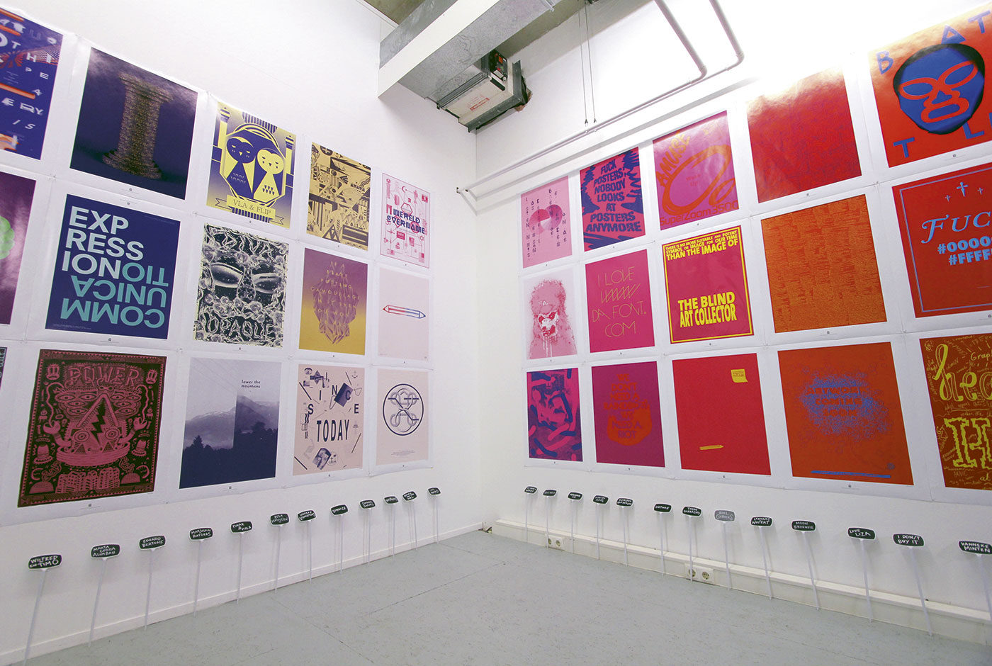
Ship of Fools was a gallery initiated by the studio to showcase graphic art and illustration. At its conception there were no galleries of this kind in the Benelux. Graphic art or illustration was never presented in the ‘white cube’ gallery context, yet it had the quality and skill to be. Ship of Fools presented work from established artists but also new, upcoming artists. Both international and local. It showcased work that was bold, honest and striking.

Ship of Fools helped to build the creative scene in The Hague providing a place holding regular exhibitions where people could go to enjoy new, exciting work. It was a way to share inspiration and talent.

The name Ship of Fools comes from the painting of Hieronymus Bosch, the first real character designer. The painting depicts a ship filled with fools wasting their lives playing cards, drinking, flirting, eating instead of spending it in ‘useful ways.

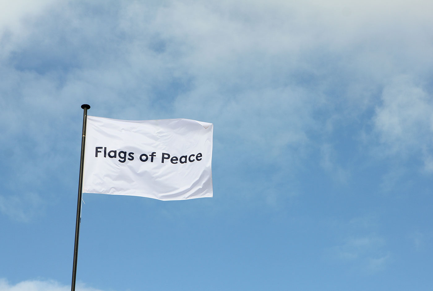
For now, the gallery is on pause while the studio focuses on the Flags of Peace foundation. An initiative gathering peace flag designs from across the globe in order to exhibit them.

Ship of Fools exhibitions:

2012

Deadorama | Solo exhibition by Mc. Bess

Bring it on! | Group exhibition of more than 50 designers and their favourite works

Trial & Error | Solo exhibition by Brecht Vandenbroucke

Going Places | Solo exhibition by Andy Rementer

Music to My Eyes | Group exhibition with 160 record sleeves

Black and White are not Colors | Group exhibitions of 100 designers and 100 posters in cooperation with fontanel.nl

2011

Really Shit | Solo exhibition by Ian Stevenson

Don’t Believe the Type III | Typography festival with workshops, lectures, exhibition | Niessen en de Vries, Mario Hugo, Sean Freeman, Si Scott, HORT, Jeff Canham, among others

2010

AnalogFest | Festival on analogue techniques with workshops, lectures, exhibition | Jon Burgerman, Anthony Burrill, among others

More is a Bore | Group exhibition on minimalistic graphic design | Buro Destruct, Noma Bar, Leandro Castelao, Gorilla, among others

Summer School | Group exhibition of old school maps | ROA, Ian Stevenson, Merijn Hos, among others

Absurdism is our Religion | Group exhibition on absurdism | Gummbah, Andrew James Jones and Mudwig, among others

Don’t Believe the Type II | Typography festival in Shanghai with workshops, lectures, exhibition | Underware, Trapped in Suburbia, Yomar Augusto, among others

Bode, Botlek, Erosie | Exhibition of Luuk Bode, Daan Botlek & Erosie

2009

Don’t Believe the Type I | Typography festival with workshops, lectures, exhibition | Alex Trochut, Luca Barcellona and Job Wouters, among others

Jackyll & Hyde | Solo exhibition Superoboturbo

You Give Me Fever | Solo exhibition of Erwin van Amstel

Ship of Fools | Opening group exhibition with Jon Burgerman, Andy Rementer, among others

Flags of Peace

Throughout history there have been several attempts to establish a peace flag. A universal collection of symbols exist that we associate with peace yet no single peace flag has gained complete international recognition and permanence. What defines peace? How could it be symbolised? And what can a peace flag achieve?

With this project the studio seeks to answer these questions. The project aims to gather a flag design from every nation in the world. Through contributions from both established and young talented designers, artists and other creatives it creates a visual dialogue around peace and its symbolism. Together the flags form a traveling exhibition and present a global spectrum of ideas on peace, each highlighting particular relationships and views towards the topic.

Art and design can be a binding factor between people, cultures and countries. It can contribute to better communication between individuals, close gaps and help work towards a more peaceful world.

Flags of Peace is a work in progress, more flags are still to come.

flagsofpeace.com


Trapped in Suburbia award

Bronze | 2015 European Design Awards

Hebbes!

Museum Gouda was one of the few museums in the world to take the first steps towards liberating their historic collections as 3D scans for all to view. Hebbes! (Gotcha) is a space within the museum dedicated to presenting the now digitalised collection.

A display inside the room allows the visitor to select an item from the collection. Then using a small cube the visitor can rotate the scanned item to view it in 360° on a large 3D holographic screen.

Auto Play

This interactive installation part of Graphic Design Festival Breda 2015 is a series of Sound Posters that respond to passing movement. Displayed in the 3sec.gallery, an exhibition space along the entrance of a parking garage, the viewer can have only three seconds to drive past and view the posters.

Each of the twenty-five posters react to passing cars, cyclists and pedestrians producing individual sound bites that when heard together form a composition. In collaboration with Koen Herfst (drummer to Armin van Buuren among others) this installation forms an experimental interplay between analogue and digital, picture and sound.

Just Peace

justpeacethehague.com


Trapped in Suburbia award

Gold | 2015 International Design Award

XXS Dutch Design

Stamp design is a very rich tradition in Dutch design so much so stamps are seen as miniature works of art. They cover all kinds of subjects and tell all sorts of stories. They capture the world on a tiny piece of paper. In XXS Dutch Design visitors step into this world immersing themselves in a sea of 1,200 larger than life stamps.

The exhibition showed the stamp design process with the work of Dick Bruna, Irma Boom, de Designpolitie, Rineke Dijkstra, Joost Swarte, Anton Corbijn and Studio Job. The latest royal stamp was also presented for the first time with the exhibition being opened by King Willem Alexander himself.

Additional photos by Fred Ernst


Trapped in Suburbia award

Silver | European Design Awards
Silver | International Design Awards

On The Road – Travelling with the Photographer

How can photography be experienced in a new way? On The Road – Travelling with the Photographer marks the first in a series of exhibitions showcasing the National Archive’s photography collection of over 14 million images. The selection is a journey through history showing the prominence of travel in the development of photography.

Since this is the first in a series of exhibitions, the entire structural design is a modular system that can be easily deconstructed and rebuilt in different layouts for future exhibits. In addition we’ve designed a unique hanging system that is flexibel, safe, 80% faster and does not damage the walls.

Additional photos by Anne Reitsma

Silent Helpers – 100 Years of Cordaid

This travelling exhibition shows that you need not be a Mandela to be a good person. Doing something good for others can be simple and may not always obvious or even recognised. Cordaid believes there exists a silent helper in everyone. Within homes live silent helpers and behind each door is an interesting story to tell.

The exhibition is made up of four parts:

The Status Quo

Cordaid see sharing as the easiest way to help others. Using red balls, visitors of the exhibition can answer the question “Wat deel jij?” (What do you share?). During the exhibition their answers contribute to a growing interactive infographic.

Meet the Silent Helpers

Behind every door the story of a silent helper is told through video and print.

The History of Cordaid

On the outside of the houses the visitor can read about the 100 years of Cordaid.

I Want to Share This With You

An analogue version of the ditwilikmetjedelen.nl website, this wall shares many stories of silent helpers and as more stories are published online the wall grows with it.

Silent Helpers – 100 Years of Cordaid travelled throughout the Netherlands and to make this an easy and efficient process each element of the construction fits the size of a standard palette. Meaning the complete exhibition can be quickly condensed into one lorry.

Weer Toekomst!

This travelling exhibition presents the story of refugee integration through the photographs of Ahmet Polat, Dutch photography laureate of 2015. The exhibition travels throughout the Netherlands to various venues including museums and universities, consequently the design is formed from a collection of installations able to adapt to the different environments. The various panels present photos, written stories and recorded interviews of each refugee.

An important part of the exhibition is the calendar wall. Each calendar represents one year in the life of a refugee while staying in the Netherlands. The sheets of each calendar can be torn off and taken home to create a do-it-yourself exhibition.   

Polat followed several students of UAF, the Foundation for Refugee Students who support highly skilled refugees in the Netherlands by helping with their study and transferring their existing qualifications into acknowledged Dutch ones. The photographs and accompanying stories capture the process of integration for these various individuals and document their new future in the Netherlands.

The name Weer Toekomst sheds a positive light on the new futures for these individuals, especially when ‘future’ can be an uncertainty for refugees.

Cover! – 85 Years of VPRO Gids Covers

Cover! marks 85 years of VPRO Gids, the television guide of Dutch broadcast station VPRO. This particular broadcast station has played a crucial part in Dutch design history with the guide being a focal point.

This exhibition at the Museum of the Image in Breda was a tribute to this magnificent series of publications. The VPRO were one of the early commissioners of talented designers and artists to design their covers.

Medieval basement

The redesign of this medieval exhibit in Museum Gouda focused on capturing the imagination and curiosity children had when entering but also making it exciting and informative. Translating all the information into UV illustrations means that to the naked eye nothing is visible. Only with the use of a UV torch can the visitor explore the space and discover facts and stories about the equipment hidden all over the floor. Shining a light on the dark history of the middle ages. Thus placing the visitor in the mindset of this curious, imaginative child and forcing them to search around.


Trapped in Suburbia award

Gold | European Design Awards
Silver | International Design Awards

Graphic Happiness II


The catalogue accompanying Grafisch Geluk (Graphic Happiness), an exhibition of 100 years of graphic design, tells the story of one specific part to Dutch design history. This is de Jong, one of the most famous Dutch printers. They were the first to work really close with designers like Wim Crouwel, Dick Bruna, Anthon Beeke and Otto Treuman and carried out all kinds of experiments that are now considered standard printing techniques.

The cover of the book consists of five loose covers that together form the logo of the printer, de Jong. This symbolises the special collaboration between the printer and the designer, working together they produced their best designs.


Trapped in Suburbia award

Silver | 2012 International Design Awards