Grafisch Geluk

Grafisch Geluk (Graphic Happiness) presents 100 years of Dutch graphic design. It showcases the work of Wim Crouwel, Dick Bruna, Anthon Beeke, Otto Treuman and many more. The exhibition looks into designers trying to find happiness in their work, in graphic design.

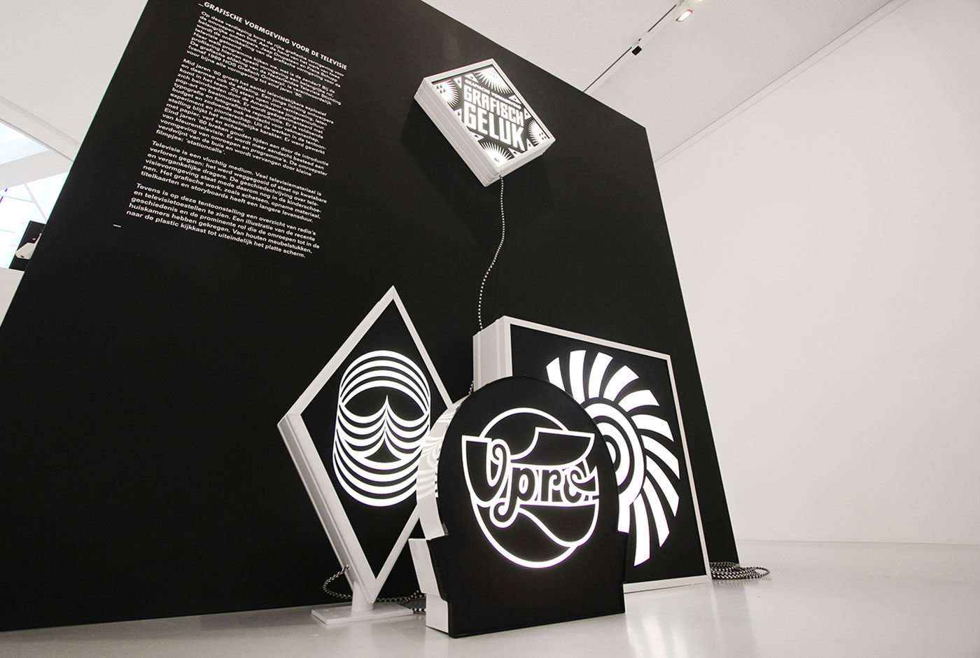
Outside of design many people search for happiness in Las Vegas. The city has become synonymous with the idea. Inspired by the signs of Las Vegas the complete exhibition signage system is made from light boxes, turning the space into a dazzling display of iconic work and literally illuminating design history.

All the signage is black and white not to conflict with the vast array of colourful work on show.

Trapped in Suburbia award

Silver | International Design Awards

Graphic Happiness I


Graphic Happiness consists of a publication, traveling exhibition and educational programme covering 100 years of Dutch graphic design. Travelling through China the exhibition showed work of over 60 designers highlighting their love of design. 

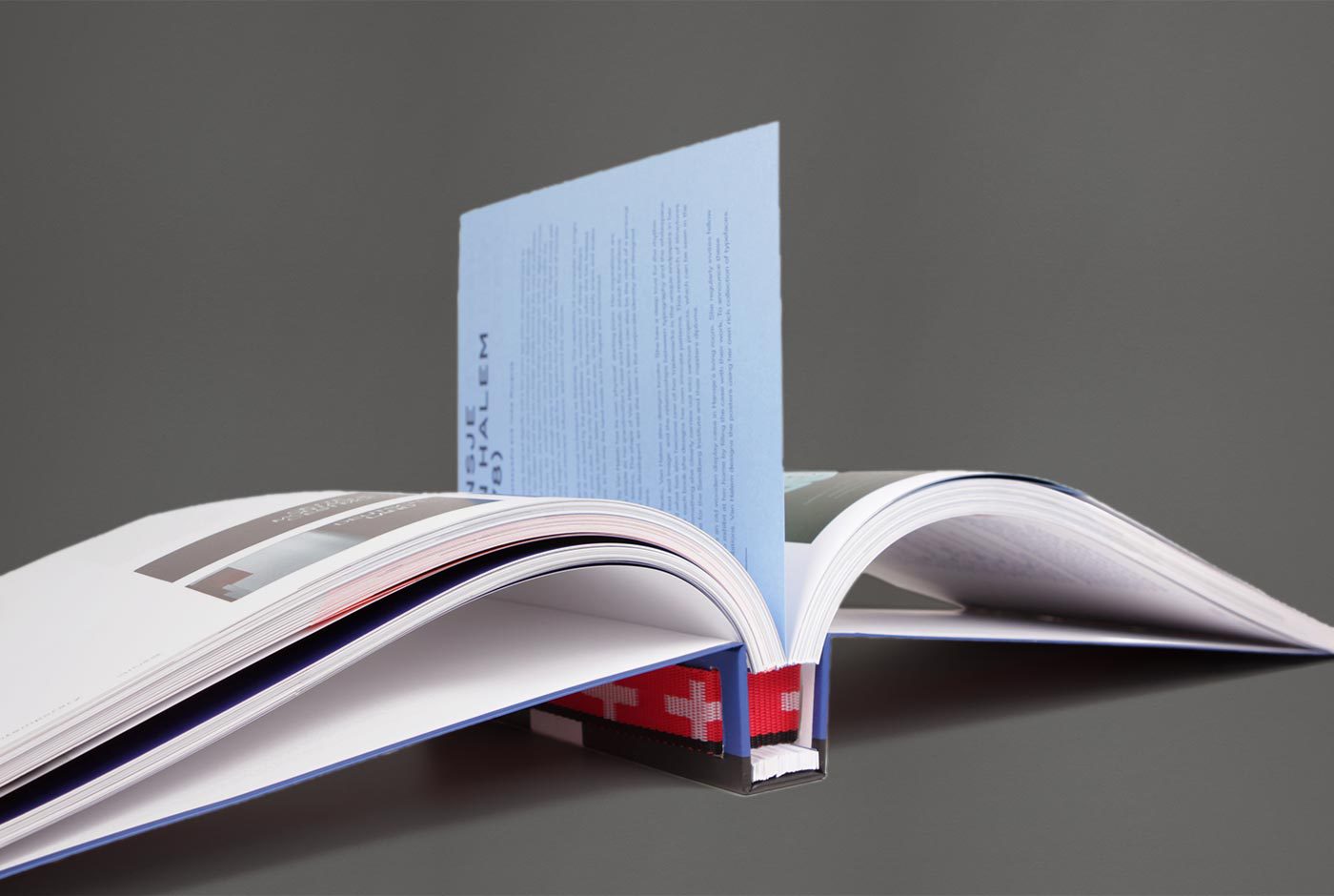
Based on the Chinese symbol of ‘double happiness’ and the Dutch flag (red, white and blue) the logo symbolises the two countries uniting in design. The logo is divided and produced as three different straps which hold together the exhibition furniture and bind the publication. The logo is literally and metaphorically the binding factor in the whole design.

The publication consists of 246 loose pages presenting work by Dick Bruna, Wim Crouwel, Theo van Doesburg, Anthon Beeke, Lust, Thonik, Niessen & de Vries, Studio Dumbar, Trapped in Suburbia among others.

Graphic Happiness is available from Museum Hilversum for €32,50 as a bilingual English/Chinese edition.


Trapped in Suburbia award

Silver | 2013 European Design Awards
Bronze | 2013 International Design Awards
Bronze | 2012 Hiiibrand Awards

Graphic Happiness II


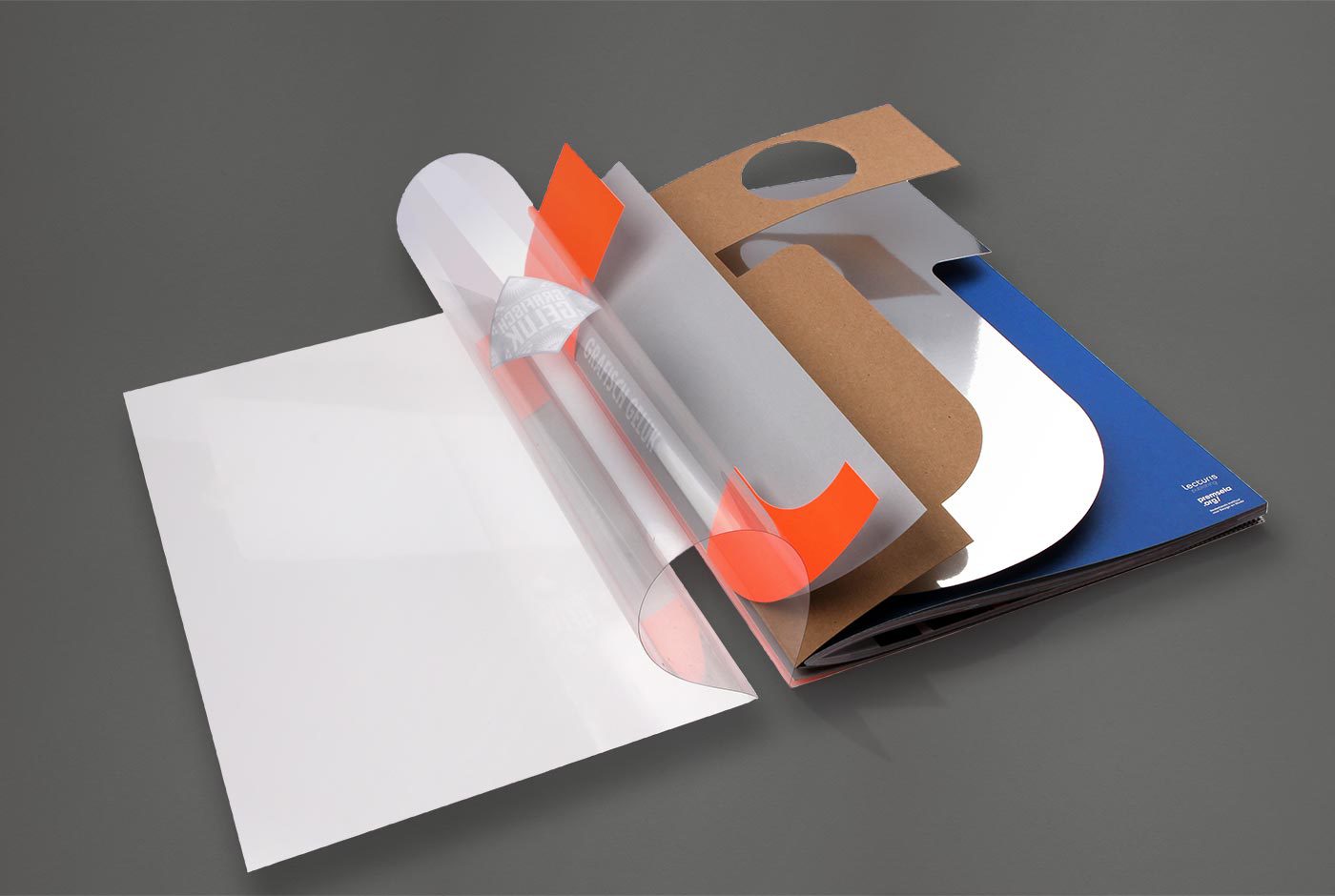
The catalogue accompanying Grafisch Geluk (Graphic Happiness), an exhibition of 100 years of graphic design, tells the story of one specific part to Dutch design history. This is de Jong, one of the most famous Dutch printers. They were the first to work really close with designers like Wim Crouwel, Dick Bruna, Anthon Beeke and Otto Treuman and carried out all kinds of experiments that are now considered standard printing techniques.

The cover of the book consists of five loose covers that together form the logo of the printer, de Jong. This symbolises the special collaboration between the printer and the designer, working together they produced their best designs.


Trapped in Suburbia award

Silver | 2012 International Design Awards