Arita Ceramics Symposium

The Arita Ceramics Symposium was held in November 2016 in Arita in Japan. Arita ware is one of Japans most famous ceramics and rich in tradition. This book is the transcript of the symposium and is a gift for the speakers and organizers. During the 2 days lots of valuable information on ceramics is shared between different cultures and this is not be be lost.

The brief was to design a book that shows the full transcript of the symposium in both English and Japanese and turn this into something special and a collectors item.

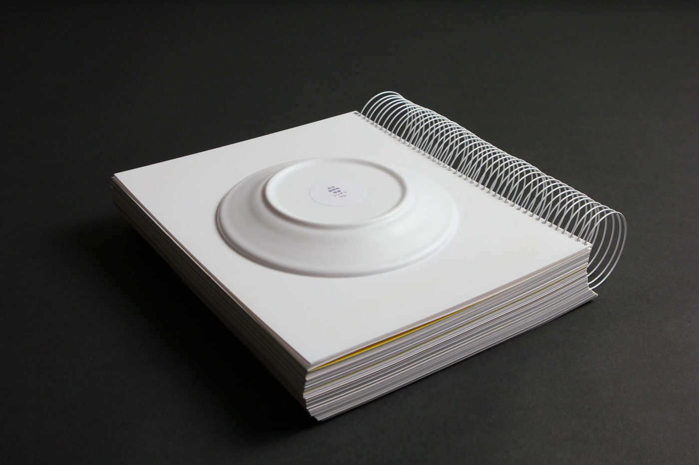
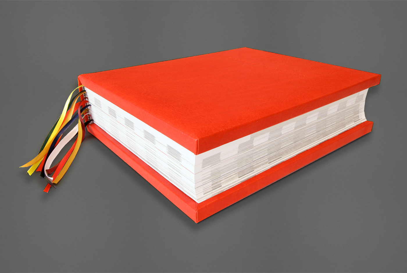
The essence of the symposium is Ceramics. Therefore we chose to have a ceramic platter on the cover of the book. On the front cover the is the image of the ceramic platter, this represents the talking about ceramics. And on the back we have a 3D moulded Arita ware platter, which represents the actual making of the ceramics. This also makes the book float when you lay it on the table and keeps the big wiro- spine elevated.

The inside contains different grams of paper from 300 grams on the outsides it slowly transforms from 280, 260, etc into lighter paper 80 grams on the heart of the book. The represents the different possibilities of ceramics. It can be really thick and strong, but also fragile and transparent.

Because of almost 400 pages there was no wire-o available to bind the book and this had to be custom made by hand by the binder. This book is the first of it’s kind with such a big wire-o.
All the above and the run of just 35 copies makes the book a unique design and a collectors item.


Trapped in Suburbia award

Silver | European Design Awards

Privacy policy

Trapped in Suburbia, located at Overhoeksplein 2, 1031 KS Amsterdam, is responsible for the processing of personal data as shown in this privacy statement.

Contact details:

https://www.trappedinsuburbia.com Overhoeksplein 2, 1031 KS Amsterdam +31641378382

Karin Langeveld is the Data Protection Officer of Trapped in Suburbia He / she can be reached via karin@trappedinsuburbia.nl

Personal data that we process

Trapped in Suburbia processes your personal data by using our services and / or by providing this information to us.

Below is an overview of the personal data we process:

– First and last name

– Address data

– Phone number

– E-mail address

– Other personal data that you actively provide, for example by creating a profile on this website, in correspondence and by telephone

– Bank account number

Special and / or sensitive personal data that we process

Trapped in Suburbia processes the following special and / or sensitive personal data of you:

– sex, race (only in the case that we process a (pas) photo of you in a design this is possible to read on the basis of the image.
For what purpose and on what basis we process personal data

Trapped in Suburbia processes your personal data for the following purposes:

– To deliver goods and services to you, or to make the design

Automated decision-making

Trapped in Suburbia does not make decisions based on automated processing on matters that can have (significant) consequences for people. These are decisions taken by computer programs or systems, without a person (for example a Trapped employee in Suburbia) sitting in between.

How long we store personal data

Trapped in Suburbia does not store your personal data longer than is strictly necessary to achieve the goals for which your data is collected. We use the following retention periods for the following (categories) of personal data:

(Category) personal data> Retention period> Reason

– First and last name, Address details, Telephone number, E-mail address of clients> 2 years> to stay in touch.

– First and last name, Address details, Telephone number, E-mail address of applicants> 4 weeks> to stay in touch.

– Other personal data that you actively provide by, for example, creating a profile on this website, in correspondence and by telephone> 2 years> in order to remain in contact.

– Bank account number, VAT number, kvk number of clients> 2 years> only in use of house style design, as backup files

– Special and / or sensitive personal data (see above)> immediately after the assignment, these files will be deleted

Sharing personal data with third parties

Trapped in Suburbia provides only to third parties and only if this is necessary for the execution of our agreement with you or to comply with a legal obligation.

Cookies, or similar techniques, that we use

Trapped in Suburbia uses only technical and functional cookies. And analytical cookies that do not infringe your privacy. A cookie is a small text file that is stored on your computer, tablet or smartphone when you first visit this website. The cookies we use are necessary for the technical operation of the website and your ease of use. They ensure that the website works properly and remember, for example, your preferences. We can also optimize our website with this. You can opt out of cookies by setting your internet browser so that it does not store cookies anymore. In addition, you can also delete all information previously saved via the settings of your browser.

View, modify or delete data

You have the right to view, correct or delete your personal data. You also have the right to withdraw your consent to the data processing or to object to the processing of your personal data by Trapped in Suburbia and you have the right to data portability. This means that you can submit a request to us to send the personal information we hold to you or another organization mentioned by you in a computer file.

You can send a request for access, correction, deletion, data transfer of your personal data or request for cancellation of your consent or objection to the processing of your personal data to karin@trappedinsuburbia.nl.

To ensure that the request for access has been made by you, we ask you to send a copy of your ID with the request. Make your passport photo, MRZ (machine readable zone, the strip with numbers at the bottom of the passport), passport number and Citizen Service Number (BSN) black in this copy. This is to protect your privacy. We respond as quickly as possible, but within four weeks, at your request.

Trapped in Suburbia also wants to point out that you have the possibility to file a complaint with the national supervisory authority, the Dutch Data Protection Authority. This can be done via the following link: https://autoriteitpersoonsgegevens.nl/nl/contact-met-de-autoriteit-persoonsgegevens/tip-ons

How we protect personal data

Trapped in Suburbia takes the protection of your data seriously and takes appropriate measures to prevent misuse, loss, unauthorized access, unwanted disclosure and unauthorized modification. If you feel that your data is not properly secured or there are indications of abuse, please contact our customer service or via karin@trappedinsuburbia.nl

AnalogFest

AnalogFest is a festival that celebrates analogue techniques with workshops, exhibitions, pop-up shops, parties and lectures by international artists including Anthony Burrill and Jon Burgerman. The festival would take old techniques and bring them back to life.

For the identity wise old Dutch sayings are designed in an old typeface that is transformed into a quirky modern version. To promote the festival the studio collaborated with local designers to make a large illustration on the venue’s windows.

The website needed of course to be as analogue as possible. Therefore, banners hand painted with the content were taken out into the street and each person presented a different banner in front of existing street webcams. This was recorded and placed into the site. On the site these videos are looped to give the impression of a live feed.


Trapped in Suburbia award

Finalist | 2011 European Design Awards

Ship of Fools

Ship of Fools was a gallery initiated by the studio to showcase graphic art and illustration. At its conception there were no galleries of this kind in the Benelux. Graphic art or illustration was never presented in the ‘white cube’ gallery context, yet it had the quality and skill to be. Ship of Fools presented work from established artists but also new, upcoming artists. Both international and local. It showcased work that was bold, honest and striking.

Ship of Fools helped to build the creative scene in The Hague providing a place holding regular exhibitions where people could go to enjoy new, exciting work. It was a way to share inspiration and talent.

The name Ship of Fools comes from the painting of Hieronymus Bosch, the first real character designer. The painting depicts a ship filled with fools wasting their lives playing cards, drinking, flirting, eating instead of spending it in ‘useful ways.

For now, the gallery is on pause while the studio focuses on the Flags of Peace foundation. An initiative gathering peace flag designs from across the globe in order to exhibit them.

Ship of Fools exhibitions:

2012

Deadorama | Solo exhibition by Mc. Bess

Bring it on! | Group exhibition of more than 50 designers and their favourite works

Trial & Error | Solo exhibition by Brecht Vandenbroucke

Going Places | Solo exhibition by Andy Rementer

Music to My Eyes | Group exhibition with 160 record sleeves

Black and White are not Colors | Group exhibitions of 100 designers and 100 posters in cooperation with fontanel.nl

2011

Really Shit | Solo exhibition by Ian Stevenson

Don’t Believe the Type III | Typography festival with workshops, lectures, exhibition | Niessen en de Vries, Mario Hugo, Sean Freeman, Si Scott, HORT, Jeff Canham, among others

2010

AnalogFest | Festival on analogue techniques with workshops, lectures, exhibition | Jon Burgerman, Anthony Burrill, among others

More is a Bore | Group exhibition on minimalistic graphic design | Buro Destruct, Noma Bar, Leandro Castelao, Gorilla, among others

Summer School | Group exhibition of old school maps | ROA, Ian Stevenson, Merijn Hos, among others

Absurdism is our Religion | Group exhibition on absurdism | Gummbah, Andrew James Jones and Mudwig, among others

Don’t Believe the Type II | Typography festival in Shanghai with workshops, lectures, exhibition | Underware, Trapped in Suburbia, Yomar Augusto, among others

Bode, Botlek, Erosie | Exhibition of Luuk Bode, Daan Botlek & Erosie

2009

Don’t Believe the Type I | Typography festival with workshops, lectures, exhibition | Alex Trochut, Luca Barcellona and Job Wouters, among others

Jackyll & Hyde | Solo exhibition Superoboturbo

You Give Me Fever | Solo exhibition of Erwin van Amstel

Ship of Fools | Opening group exhibition with Jon Burgerman, Andy Rementer, among others

Don’t Believe the Type

Don’t Believe the Type was established as an alternative to existing design festivals. At the time, such festivals were either incredibly expensive, too far away or very traditional, especially when focused on typography. Don’t Believe the Type (DBTT) was an opportunity for inhabitants of the The Hague and surrounding areas to meet other creatives, learn from and be inspired by international leading talents and have some fun, all at an affordable price.

Coinciding with the Ship of Fools gallery (also initiated and run by the studio) the festival featured lectures, workshops and exhibitions. The first edition took place in 2010 in The Hague, after which the festival was invited to the Shanghai World Expo in the same year. For the third and final edition, DBTT returned to The Hague in 2011.

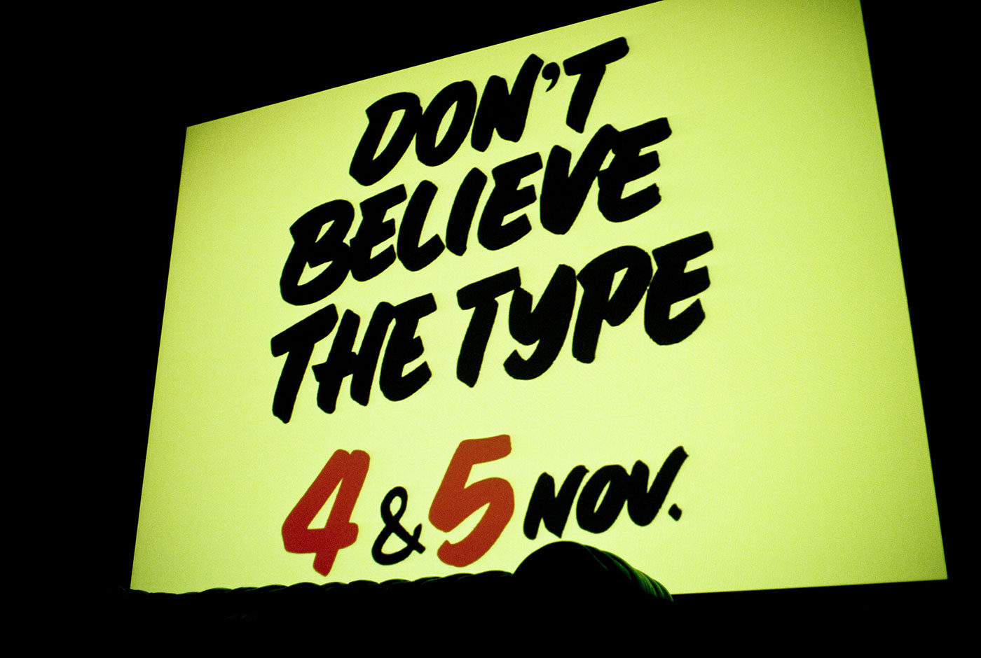
Each edition centred on typography but pushed different themes. The final edition focused on sign painting and following this theme the identity used the talents of traditional Dutch sign painting, cheese signs. In cheese shops across the country and even into Belgium and Germany, hand painted signs adorn the various types of cheeses in thick, black lettering. All the promotion and signage for Don’t Believe the Type 2011 was hand painted by the actual, original cheese shop owner who made this practice notorious.

Don’t Believe the Type has hosted:

Luca Barcellona, Job Wouters, Yomar Augusto, Alex Trochut and Martijn Sandberg, 44 Flavours, Alina Günter, Alex Trochut, Alex Purdy, Andy Rementer, Autobahn, Chris Piascik, Daan Knirim, Hansje van Halem, Janno Hahn, Job Wouters, Jonathan Looman, Lennard Schuurmans, Luca Barcellona, Marta Cerdà Alimbau, Martijn Sandberg & Underware.

Teaching

2018

‘Experience Design’ high speed workshop | Nottingham Trent University | Nottingham, UK


2017

‘Experience Design’ high speed workshop | ADCN club | Amsterdam, NL


2016

Masterclass ‘Experience Design’ | New Design University | St. Pölten, AT

Masterclass | Torino Graphic Days | Torino, NL

Masterclass ‘Experience Design’ | ECV | Aix-en-Provence,  FR

Masterclass ‘Experience Design’ | Grafisch Lyceum | Rotterdam, NL


2015

Make your own interactive Soundcard workshop | Droog | Amsterdam, NL

Masterclass ‘Experience Design’ | Augsburg University of Applied Sciences | Ausburg, DE

Masterclass ‘Experience Design’ | Nanjing University | Nanjing, CN


2014

Masterclass ‘Experience Design’ | OpenSet | Rotterdam, NL

Masterclass ‘Experience Design’ | Falmouth University | Falmouth, UK


2013

Masterclass ‘Experience Design’ | University College of Falmouth UK


2012

Workshop ‘Graphic Interventions’ | Graphic Design Festival Breda | Breda, NL

Workshop ‘Playful Design’ | Falmouth University | Falmouth, NL

Workshop ‘Visual Storytelling’ | Taiga Institute | St Petersburg, RU


2007- 2010

Typography teacher at the Utrecht School of the Arts | Utrecht, NL

Shy Poster

Expanding the Sound Poster series, the Shy Poster furthers this inquiry into new experiences with the traditional poster medium.

This time the poster gains personality by personifying shyness in an interactive installation. If the poster is left alone its colourful inner character is revealed. However, if someone interrupts this personal comfort zone the poster immediately retracts its doors hiding itself within the conformity of its background.

Providing the new visitor is patient and tactful, the Shy Poster will become comfortable and slowly reveal its true personality. Yet, you must be careful…

Any large movements are detected by motion sensors which trigger the doors to slam shut!

With special thanks to Alice Stewart and Jiawei van Kleef.

Diligentia Theater

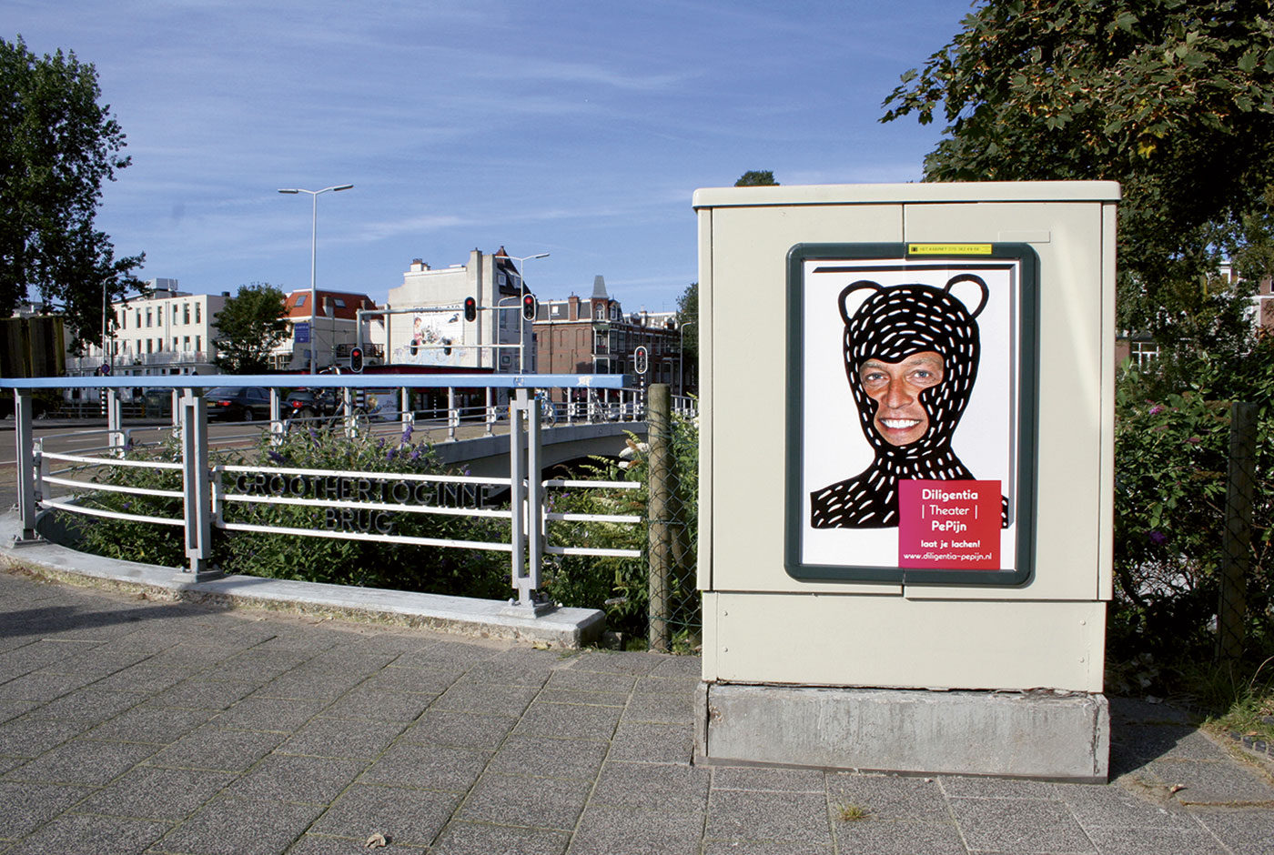
Humour is not always universal. Different people find different things funny yet this poster campaign for comedy theatre Diligentia had to be humorous for many people. Reminded of childhoods spent drawing on photos in gossip magazines this seemed a common experience. This campaign takes that idea to the streets.

Using a portrait of the theatre director a simple poster was designed and printed. Colleagues, fellow designers, friends and students were then invited to join in with the fun. Just like those magazines the posters were customised into unique designs. Over 150 different posters were created and displayed around The Hague.

Awards

2018

European Design Awards

Silver | Books | Arita Ceramic Symposium


2017

European Design Awards

Bronze | Books | Talking Ceramics 1

International Design Awards

Gold | Books | Talking Ceramics 1


ADCN Awards
Nomination | Books | Talking Ceramics 1


2016

European Design Awards

Bronze | Self-initiated Projects | Flags of Peace

Hiii Brand Awards

Bronze | Branding | Driiip


2015

Hiiibrand Awards

Bronze | Corporate Identity | Hague Talks

Merit | Corporate Identity | Develops

International Design Awards

Gold | Corporate Identity | Just Peace

Silver | Calendars | Aim for the day


2014

European Design Awards

Silver | Exhibits | XXS Dutch Design

Silver | Books | Het echte werk

Silver | Posters | Sound Poster

International Design Awards

Silver | Exhibits | XXS Dutch Design


2013

European Design Awards

Silver | Books | Graphic Happiness II

Bronze | Books | Amsterdam Opportunity Zones

Finalist | Corporate Identity | Who’s the fool?

Hiiibrand Awards

Gold | Corporate Identity | Suited Concepts

Bronze | Corporate Identity | Graphic Happiness II

Merit | Corporate Identity | Who’s the fool?

Finalist | Corporate Identity | Fresh Tracks Europe

International Design Awards

Silver | Exhibits | Graphic Happiness II

Bronze | Books | Graphic Happiness II


2012

European Design Awards

Silver | Corporate Identity | Fresh Tracks Europe

Finalist | Corporate Identity | Design it Yourself

International Design Awards

Silver | Books | Graphic Happiness

Silver | Identity | Fresh Tracks Europe

Silver | Exhibits | Design it Yourself

Silver | Exhibits | Graphic Happiness


2011

D&AD Award

Short listed | Poster design | ‘I think I like it better with the silver square’, Graphic Design Festival Breda

European Design Awards

Bronze | Corporate Identity | Work a lot

Bronze | Corporate Identity | Suited Concepts

Finalist | Self Initiated Projects | Analog Fest

International Design Awards

Gold | Corporate Identity | Suited Concepts

Red Dot Design Award

Red Dot Award | ‘I think I like it better with the silver square’, Graphic Design Festival Breda


2010

Creative Ambassadors City of The Hague

European Design Awards

Gold | Exhibits | Torture Basement

Silver | Book cover | Where there is smoke, there is fire

Finalist | Book design | Hi Brand book

International Design Awards

Silver | Exhibits | Torture Basement

Bronze | Books | Creative City The Hague


2009

European Design Awards

Silver | Corporate Identity | Coos!

International Design Awards

Bronze | Corporate Identity | Gouda bij Kunstlicht


2008

European Design Awards

Bronze | Printed Self promotion | Play More Note Pad

Develops

Turning waste into identity.

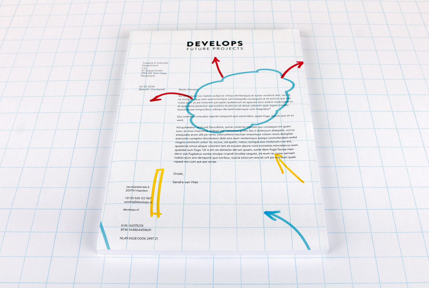
Develops, a company that turns ideas into a reality, uses flip-over charts to sketch and explain processes to their clients. A used chart is then cut into the various parts that form the identity: letterheads, business cards, notepads and envelopes. Simple, no big print costs and it gives use to waste material.

Consequently, Develops creates its own identity and every element becomes unique. People don’t experience a representation of their process but the real thing and always the actual flip-over paper.

develops.nl

Escamp

This city lab is a multipurpose talent centre in the Escamp neighbourhood of The Hague. Not only does this design brand the lab but in turn creates an identity for the complete neighbourhood.

Community and togetherness are the foundations of the Escamp identity. The lab was established to break down cultural barriers between and unite different groups living in the neighbourhood. Activities focused around: art, design, media, technology and global cuisine attempt to build a sense of team spirit in the area.

A sports team offers camaraderie and transcends differences just as Escamp wished to achieve. Therefore, the identity uses a bold and unique colour scheme, like a football strip, to build a recognisable brand. This main aspect is then flexible to adapt to illustration, campaigns, signage, stationary and so on.

The identity also plays with the word ‘Escamp’ to highlight the variety of activities on offer at the city lab.

Love Life Festival

Love Life Festival was organised to raise safe sex awareness amongst younger inhabitants of The Hague. The campaign’s strong visual identity places the heart as the most important role. The heart symbolises two people having sex, becoming one, but remaining separate by protecting themselves. Aids and other STDs effect all sorts of people, no matter their social background or sexual preferences. Consequently, the colour scheme is free from associations, only the reference to nightlife where the majority of the target audience is found.

Visuals are accompanied by witty short copy provoking visitors to smile but also think about the important subject. This is a different and new approach to bringing the message of safe sex because merely scaring people just does not work. Humour can help discuss these tricky subjects. For instance, a tram that reads “Take me, take me now!”, toilet stickers that read “Make me wet”, crew shirts that read “(s)crew” or for the bar crew “I can make you come twice”, mirror stickers that read “Mirror, mirror on the wall, who is the sexiest of them all?”, free cards that scream “Take me!” and promotion teams with billboards that display “If you like my back, you should check the front”.

The festival also included the One Night Stand Up Comedy and a dance event called I’m Gonna Make You Sweat.

Hebbes!

Museum Gouda was one of the few museums in the world to take the first steps towards liberating their historic collections as 3D scans for all to view. Hebbes! (Gotcha) is a space within the museum dedicated to presenting the now digitalised collection.

A display inside the room allows the visitor to select an item from the collection. Then using a small cube the visitor can rotate the scanned item to view it in 360° on a large 3D holographic screen.

Auto Play

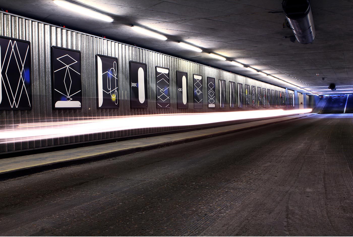
This interactive installation part of Graphic Design Festival Breda 2015 is a series of Sound Posters that respond to passing movement. Displayed in the 3sec.gallery, an exhibition space along the entrance of a parking garage, the viewer can have only three seconds to drive past and view the posters.

Each of the twenty-five posters react to passing cars, cyclists and pedestrians producing individual sound bites that when heard together form a composition. In collaboration with Koen Herfst (drummer to Armin van Buuren among others) this installation forms an experimental interplay between analogue and digital, picture and sound.

Driiip

Three circles in the Driiip identity represent the stages and elements to drip irrigation – water, life and earth. Drip irrigation is an extremely precise and water conserving method of irrigation which slowly releases droplets of water directly to the root over a long period.

These three elements return throughout the identity in graphic illustrations of the process and photography of luscious greenery. Placement of these also play with the physicality of materials such as earth that lies on the bottom of the letterhead.


Trapped in Suburbia award

Bronze | 2016 Hiii Brand Awards

XXS Dutch Design

Stamp design is a very rich tradition in Dutch design so much so stamps are seen as miniature works of art. They cover all kinds of subjects and tell all sorts of stories. They capture the world on a tiny piece of paper. In XXS Dutch Design visitors step into this world immersing themselves in a sea of 1,200 larger than life stamps.

The exhibition showed the stamp design process with the work of Dick Bruna, Irma Boom, de Designpolitie, Rineke Dijkstra, Joost Swarte, Anton Corbijn and Studio Job. The latest royal stamp was also presented for the first time with the exhibition being opened by King Willem Alexander himself.

Additional photos by Fred Ernst


Trapped in Suburbia award

Silver | European Design Awards
Silver | International Design Awards

On The Road – Travelling with the Photographer

How can photography be experienced in a new way? On The Road – Travelling with the Photographer marks the first in a series of exhibitions showcasing the National Archive’s photography collection of over 14 million images. The selection is a journey through history showing the prominence of travel in the development of photography.

Since this is the first in a series of exhibitions, the entire structural design is a modular system that can be easily deconstructed and rebuilt in different layouts for future exhibits. In addition we’ve designed a unique hanging system that is flexibel, safe, 80% faster and does not damage the walls.

Additional photos by Anne Reitsma

Silent Helpers – 100 Years of Cordaid

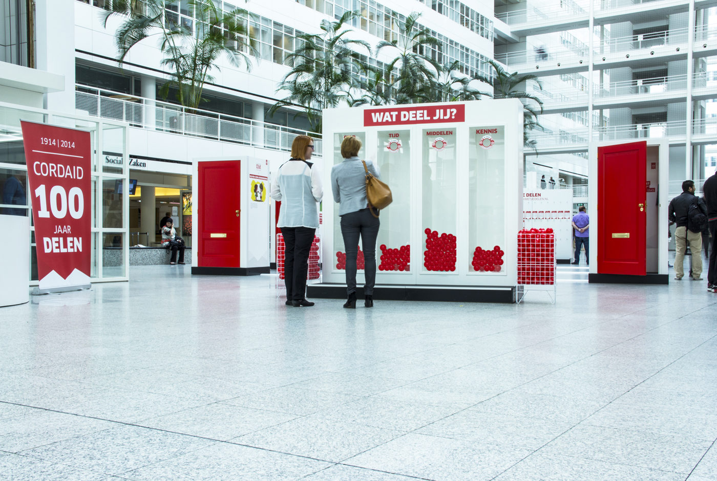
This travelling exhibition shows that you need not be a Mandela to be a good person. Doing something good for others can be simple and may not always obvious or even recognised. Cordaid believes there exists a silent helper in everyone. Within homes live silent helpers and behind each door is an interesting story to tell.

The exhibition is made up of four parts:

The Status Quo

Cordaid see sharing as the easiest way to help others. Using red balls, visitors of the exhibition can answer the question “Wat deel jij?” (What do you share?). During the exhibition their answers contribute to a growing interactive infographic.

Meet the Silent Helpers

Behind every door the story of a silent helper is told through video and print.

The History of Cordaid

On the outside of the houses the visitor can read about the 100 years of Cordaid.

I Want to Share This With You

An analogue version of the ditwilikmetjedelen.nl website, this wall shares many stories of silent helpers and as more stories are published online the wall grows with it.

Silent Helpers – 100 Years of Cordaid travelled throughout the Netherlands and to make this an easy and efficient process each element of the construction fits the size of a standard palette. Meaning the complete exhibition can be quickly condensed into one lorry.

Cover! – 85 Years of VPRO Gids Covers

Cover! marks 85 years of VPRO Gids, the television guide of Dutch broadcast station VPRO. This particular broadcast station has played a crucial part in Dutch design history with the guide being a focal point.

This exhibition at the Museum of the Image in Breda was a tribute to this magnificent series of publications. The VPRO were one of the early commissioners of talented designers and artists to design their covers.

Medieval basement

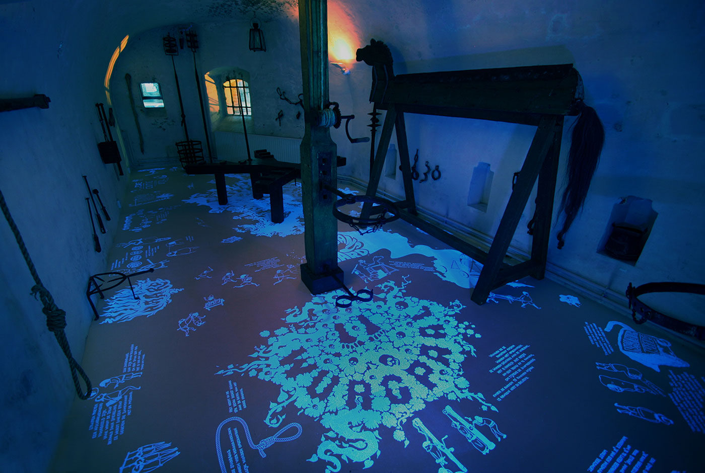
The redesign of this medieval exhibit in Museum Gouda focused on capturing the imagination and curiosity children had when entering but also making it exciting and informative. Translating all the information into UV illustrations means that to the naked eye nothing is visible. Only with the use of a UV torch can the visitor explore the space and discover facts and stories about the equipment hidden all over the floor. Shining a light on the dark history of the middle ages. Thus placing the visitor in the mindset of this curious, imaginative child and forcing them to search around.


Trapped in Suburbia award

Gold | European Design Awards
Silver | International Design Awards

Jaap Drupsteen – Designer | Explorer

To celebrate fifty-years as a practicing designer, Museum Hilversum held a retrospective exhibition on the work of Jaap Drupsteen. The exhibition showcases Jaap Drupsteen fruitful career and divides this into three sections.

The top floor presents his early audiovisual design (VPRO, Hadimassa etc) and printed objects (money, passport etc). Being a designer for screen, Drupsteen naturally starts working on black, hence the visitor enters a completely black space displaying only video work. After this the visitors moves to white – print work. Also on show are the original title rolls, all made by hand, inspiring a scrolling intro wall.

Since the exhibition features a large amount of video work a special audio system, the Sennheiser guidePORT, is used.  With the headphones on the user walks towards a screen or into a particular area and the audio is automatically heard. This prevents multiple audio tracks clashing and turning the exhibition space into musical chaos.

The Music Theatre is the second floor and displays many of Drupsteen’s theatre productions he created specifically for television. To create these unusual and inventive productions he became revolutionary in his use of chroma keying – the blue/green screen effect. To demonstrate this the visitor can experience live chroma keying by standing in a blue screen area and magically being positioned into one of Drupsteen’s works.

The lower floor presents his most recent work through two large scale projections. These are audiovisual compositions created for DJ and orchestral visuals and use a software developed by Drupsteen himself to achieve a perfect sync between image and sound.

Grafisch Geluk

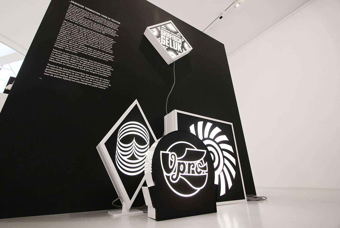
Grafisch Geluk (Graphic Happiness) presents 100 years of Dutch graphic design. It showcases the work of Wim Crouwel, Dick Bruna, Anthon Beeke, Otto Treuman and many more. The exhibition looks into designers trying to find happiness in their work, in graphic design.

Outside of design many people search for happiness in Las Vegas. The city has become synonymous with the idea. Inspired by the signs of Las Vegas the complete exhibition signage system is made from light boxes, turning the space into a dazzling display of iconic work and literally illuminating design history.

All the signage is black and white not to conflict with the vast array of colourful work on show.

Trapped in Suburbia award

Silver | International Design Awards

Room to play


Ruimte voor de spelende mens (Room to play) presents The Hague’s dream to become a utopian city based on artist Constant Nieuwenhuys’ New Babylon. Here the city is an environment where its inhabitants can focus solely on their creativity and exist as homo ludens, ‘playing man’.

This financial report documents the cultural budget distribution across the many institutions in The Hague. The document details the government’s spending for the following four years in comparison to previous.

Fulfilling the city’s dream, the design of the report actually gives the reader the opportunity to play. The content is divided into seven books which form a tangram puzzle. ‘Alles moet mogelijk blijven, alles moet kunnen gebeuren’ (Everything must remain possible, everything can happen), the report’s ethos, is emphasised through the tangram’s ability to form infinite combinations.

As a tangram puzzle the previously dry and complex document is transformed into one of creativity and joy. Additionally, the shapes of the tangram become an abstraction of The Hague’s visual identity of which the report is designed within.

This is Experience Design


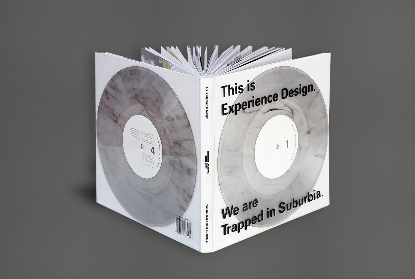
Our monograph This is Experience Design showcases the studio’s work from the past thirteen years and explains the theory behind Experience Design.

With the term Experience Design people often think of digital interaction. But not at Trapped in Suburbia. By embodying our Confucius motto: ”Tell me and I’ll forget. Show me and I may remember. Involve me and I’ll understand.” the monograph becomes an interactive publication.

Two accompanying 10” vinyl records tell the stories behind the projects. The 156 pages show only images of this work. The reader must be involved in both in order to fully experience the book and understand.

With a foreword by Erik Kessels of KesselsKramer.

Published by Coltrane & Dixon.

Listen to a sample from Side 2 – The Medium is the Message.

      The Medium is the Message (Sample) - Trapped in Suburbia


This is Experience Design is available to purchase below.

Shipping Options (Incl. Book €34,95)


Talking Ceramics 1


The kiln, the ceramicist’s oven, plays a major role in the ceramic process. Ceramicists can spend weeks creating their object yet when it is placed into the kiln all control is taken out of their hands. Even the most proficient ceramicist on opening the kiln after firing cannot predict the outcome – it could be perfection or disaster.

To experience this excitement, anxiety and surprise, the reader must literally bake the white book in an oven – watch and wait – all is revealed as the heat transforms the cover and reveals the design.

Taking Ceramics I discusses the topic of mistakes with several past artists-in-residence from the European Centre of Ceramics’ (EKWC) . Playing with the subject, the book’s layout emphasises fragility, splitting content over pages and positioning it precariously close to the edges.

The special edition furthers this theme with its 1mm thick porcelain cover. Inevitably, whether through the sheer weight of other books or mishandling the cover will crack. The reader, like the ceramicist, learns to accept and appreciate the beauty of mistakes.


Trapped in Suburbia award

Gold | 2017 European Design Awards
Bronze | 2017 European Design Awards
Nomination | 2017 ADCN Awards

Jaap Drupsteen Designer Explorer


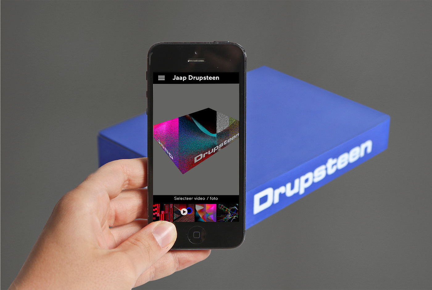
Jaap Drupsteen, legendary Dutch designer/video artist was revolutionary in the use of chroma keying, also know as the blue screen effect. This technique allowed him to superimpose actors or elements into totally different environments.

An accompanying app allows the reader to experience chroma keying firsthand. The app contains a library of video clips from Drupsteen’s productions that can be superimposed onto the solid blue book, thus bringing the monograph to life whilst explaining his process.

Video productions form the majority of Drupsteen’s oeuvre meaning every second holds a uniquely beautiful graphic image. Unlike the traditional graphic designer, Drupsteen creates twenty-five incredible images per second.

Consequently, the inside pages present over 400 stills rarely seen as individual frames, revealing their incredible colour and detail, emphasised by the fact many were created before the use of computers.

Download Jaap Drupsteen from the Apple App Store.

This book was part of the exhibition Jaap Drupsteen – Designer | Explorer  that we also designed.

Where there is smoke…


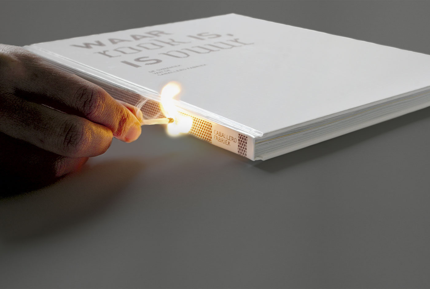
Waar rook is, is vuur (Where There is Smoke, is Fire) is a publication about the old Caballero Cigarette factory, which has been transformed into a creative work area. Where once cigarettes were made now architects, photographers, industrial designers, graphic designers and web designers carry out creative projects.

The spine and typography on the cover are silkscreen printed with a matchbox structure so you can actually strike a match on the book. Inside, several kinds of paper are use to represent the different architectural surfaces throughout the building.


Trapped in Suburbia award

Silver | 2010 European Design Awards

Graphic Happiness II


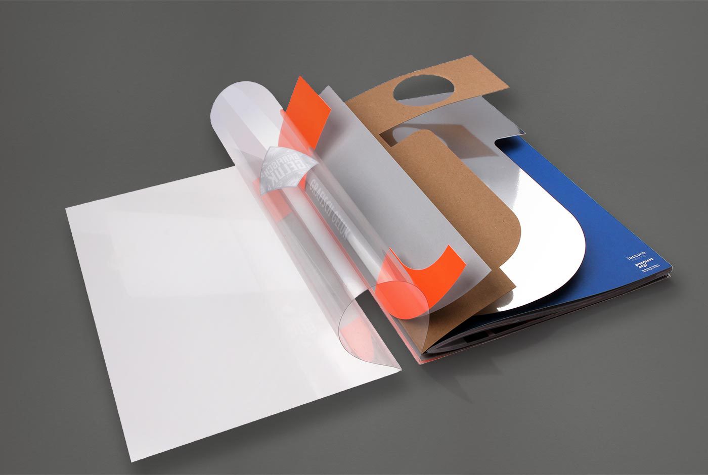
The catalogue accompanying Grafisch Geluk (Graphic Happiness), an exhibition of 100 years of graphic design, tells the story of one specific part to Dutch design history. This is de Jong, one of the most famous Dutch printers. They were the first to work really close with designers like Wim Crouwel, Dick Bruna, Anthon Beeke and Otto Treuman and carried out all kinds of experiments that are now considered standard printing techniques.

The cover of the book consists of five loose covers that together form the logo of the printer, de Jong. This symbolises the special collaboration between the printer and the designer, working together they produced their best designs.


Trapped in Suburbia award

Silver | 2012 International Design Awards

The real deal


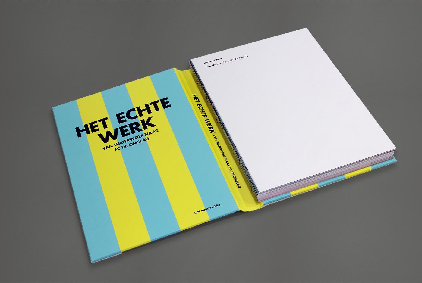
The cover of this book is turned inside out. The design is inside and the endpapers are outside. Het Echte Werk is not printed in regular CMYK. Given the subject of experimentation, cyan, magenta and yellow are replaced by neon PMS inks. However, the book is still printed as normal CMYK printwork giving a completely surprising result and making the photos ‘pop’ with vibrancy.

F.C. de Omslag is a collaboration between the library and archives of Gouda. This initiative was set up to explore and experiment how they, together with the inhabitants of Gouda, can create culture. The book is an adventure into dealing with culture in a new experimental way.

‘De Omslag’ means ‘book cover’ and refers to both the books in the library and the archive. Yet, it also means ‘turning point’, which the team believes this project could mean for them. This is the reason behind the cover being such a focal point. Turning it inside out makes you look twice and that is what F.C. de Omslag is about.


Trapped in Suburbia award

Silver | 2014 European Design Awards | Book Cover
Finalist | 2014 European Design Awards | Book Layout

Innovation in Dance


Movement and rhythm are central to the identity of Fresh Tracks Europe. Innovation in Dance for Young Audiences presents the philosophy and projects of this youth dance network in a publication that embodies dance.

Six cover variations, showing shapes taken from the identity, are choreographed as a stop motion animation adding motion and rhythm to the usually static printed object.

There is more than one truth


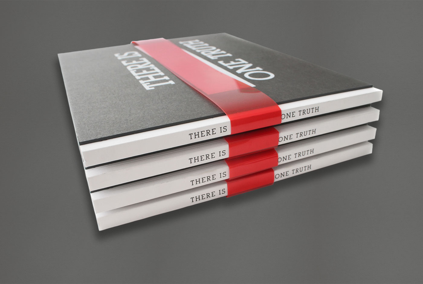
VJ Movement gives journalists and cartoonists around the world the opportunity to share their stories and tell their truths. They reveal subjects and perspectives that aren’t covered in mainstream news.

Anyone can pitch their untold story to VJ Movement and if it receives enough votes a professional VJ Cartoonist will report on this and publish it online. The best cartoons are collated in this book. Removing the translucent red band allows the reader to reveal these other truths for themselves.

Amsterdam Opportunity zones


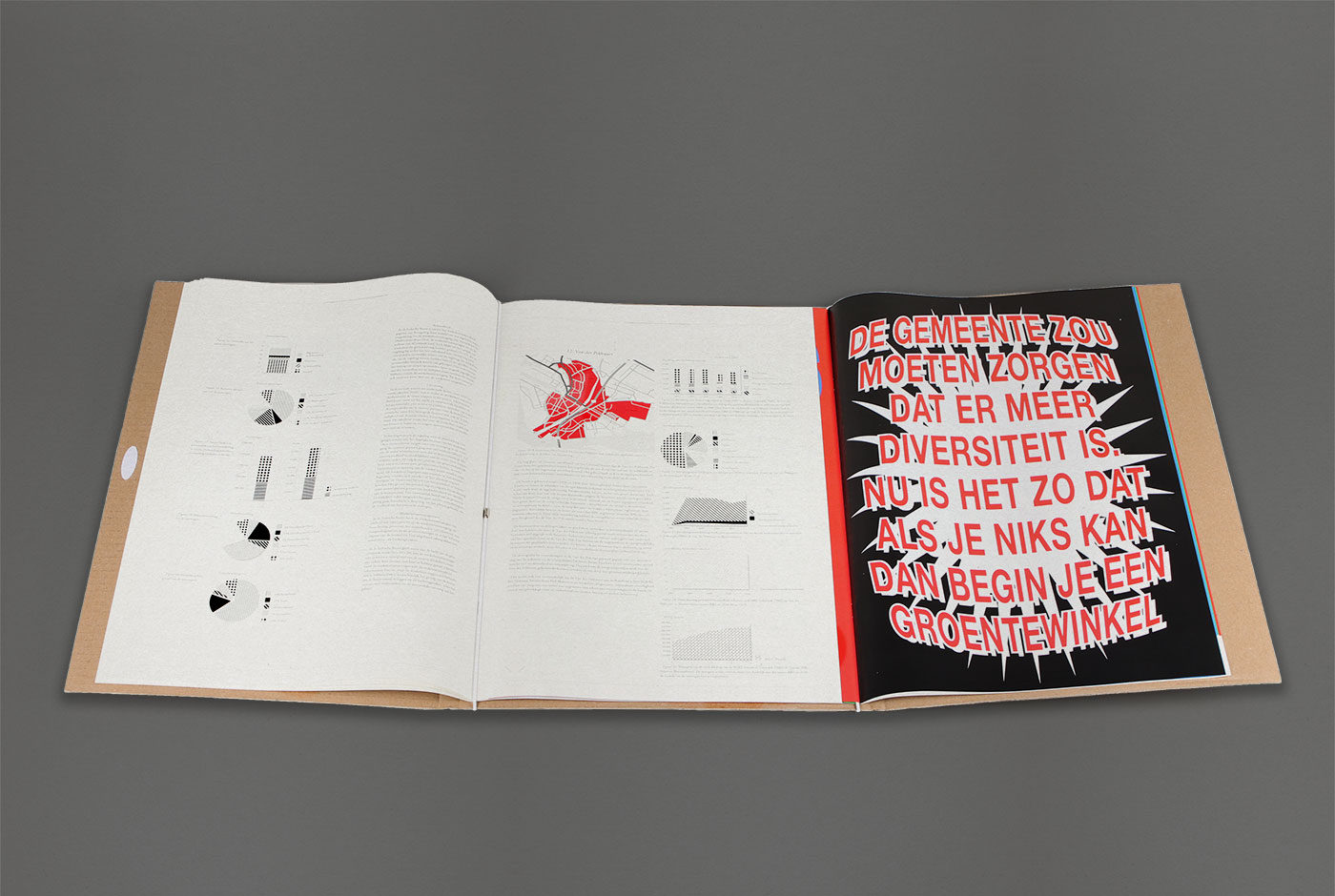
This publication shows the results of a study by the Hogeschool van Amsterdam (Amsterdam University of Applied Sciences), on the grant programme Amsterdam Kansenzones (Amsterdam Opportunity Zones). The programme provides financial opportunities for small independent retailers.

The study revealed a lack of understanding between the municipality and the shopkeepers. This dispute manifests as two booklets. One uses the visual language of the shopkeepers to express their views. The other shows the research result in the classic, formal language of the municipality.

The two booklets are interweaved meaning the reader has to consider both sides of the conversation turning a page at a time. Due to friction the two booklets cannot be pulled apart when closed highlighting the dependency these two parties have on each other.

The large A3 format stems from the researcher’s desire to make the report visible and not to be placed in a drawer never to be read.


Trapped in Suburbia award

Bronze | 2013 European Design Awards

Hi brand book


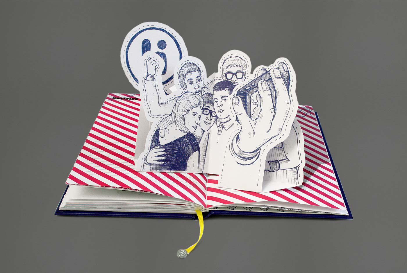
Hi is a Dutch telecom company with a target group of young adults. Instead of looking in from the outside, Hi wanted their staff to be part of this world and really live the life of their target group. Therefore the brand book is the diary a young adult full of photos, stickers, concert and train tickets, flyers and a beer mat scrawled with phone numbers. It features several scratch-off ink tests, five fold out pages, a resignation letter (if you fail the scratch tests), many illustrations, UV spot ink and a huge pop-up. You name it; it’s in there!


Trapped in Suburbia award

Finalist | 2010 European Design Awards


The gift of Sound and Vision


This farewell gift for the departing president of the Nederlands Instituut voor Beeld en Geluid (Dutch Institute for Sound and Vision) translates video and sound across 600 pages. Segments of television programmes are reproduced frame by frame making them still comprehendible even when printed. As well as the vast collection of imagery the book contains a single of David Bowie’s Sound and Vision, pop-ups, a DVD, several flip booklets and a RFID tag all bringing the printed page to life.

Creative City the Hague


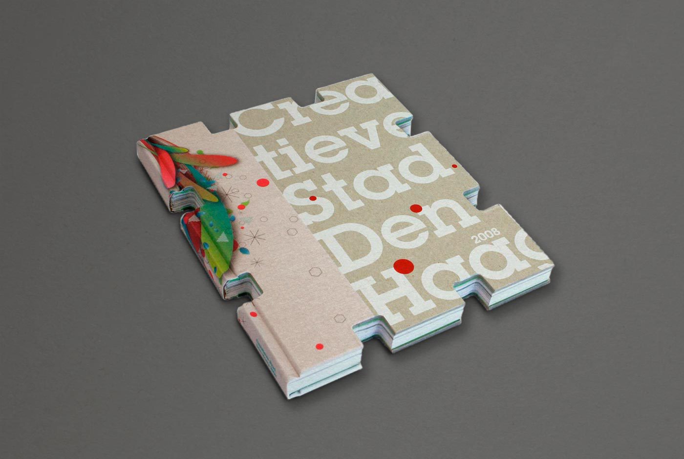
This publication gives insights into the results of Creatieve Stad Den Haag (Creative City The Hague), a development programme to progress the creative scene in The Hague. Like the creative inhabitants who build this city, the book is a building block that when united with others forms an impressive and beautiful construction.


Trapped in Suburbia award

Bronze | 2010 International Design Awards