Don’t Believe the Type

Don’t Believe the Type was established as an alternative to existing design festivals. At the time, such festivals were either incredibly expensive, too far away or very traditional, especially when focused on typography. Don’t Believe the Type (DBTT) was an opportunity for inhabitants of the The Hague and surrounding areas to meet other creatives, learn from and be inspired by international leading talents and have some fun, all at an affordable price.

Coinciding with the Ship of Fools gallery (also initiated and run by the studio) the festival featured lectures, workshops and exhibitions. The first edition took place in 2010 in The Hague, after which the festival was invited to the Shanghai World Expo in the same year. For the third and final edition, DBTT returned to The Hague in 2011.

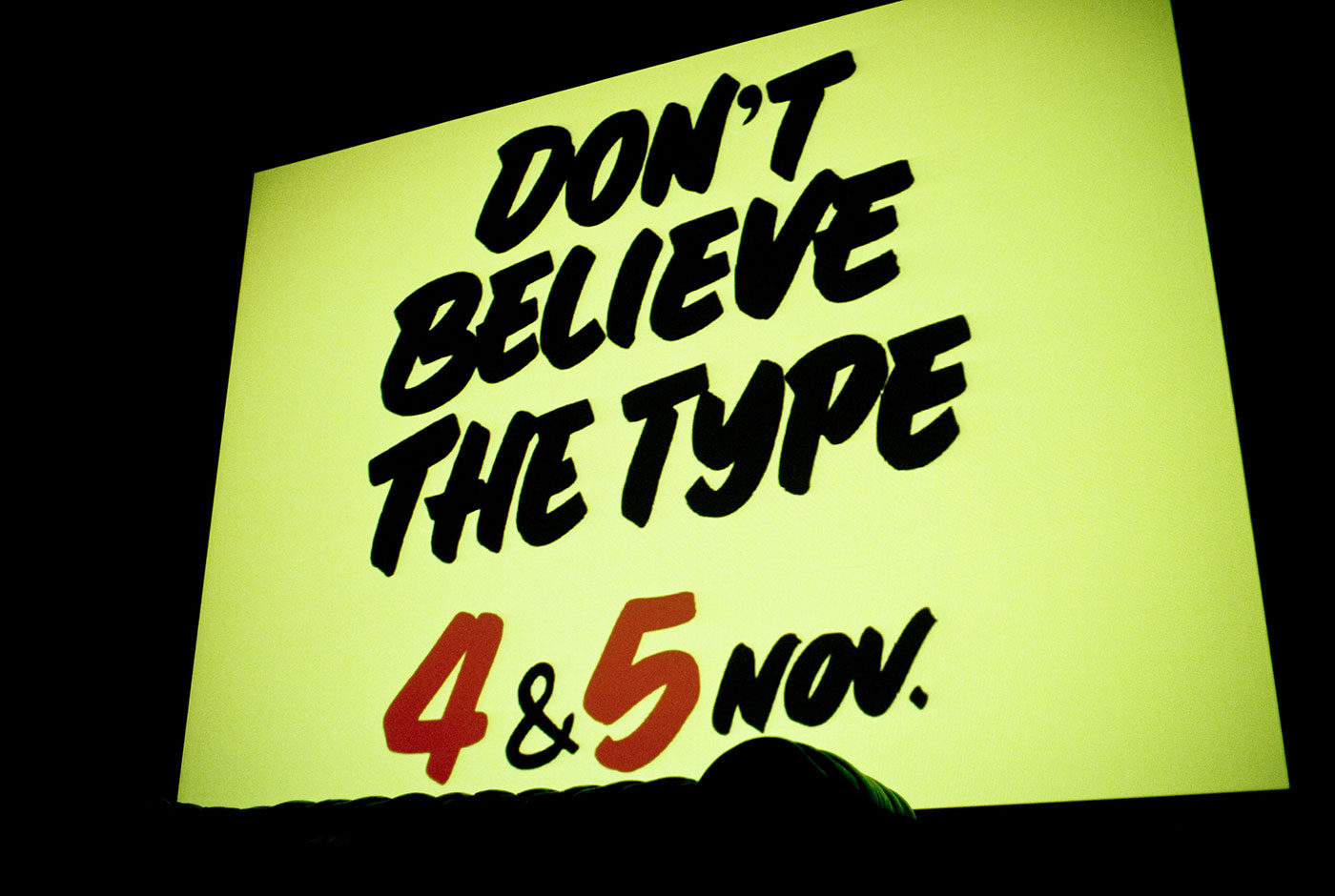
Each edition centred on typography but pushed different themes. The final edition focused on sign painting and following this theme the identity used the talents of traditional Dutch sign painting, cheese signs. In cheese shops across the country and even into Belgium and Germany, hand painted signs adorn the various types of cheeses in thick, black lettering. All the promotion and signage for Don’t Believe the Type 2011 was hand painted by the actual, original cheese shop owner who made this practice notorious.

Don’t Believe the Type has hosted:

Luca Barcellona, Job Wouters, Yomar Augusto, Alex Trochut and Martijn Sandberg, 44 Flavours, Alina Günter, Alex Trochut, Alex Purdy, Andy Rementer, Autobahn, Chris Piascik, Daan Knirim, Hansje van Halem, Janno Hahn, Job Wouters, Jonathan Looman, Lennard Schuurmans, Luca Barcellona, Marta Cerdà Alimbau, Martijn Sandberg & Underware.

Hague Talks

Hague Talks is an international travelling meeting place for creative minds, peace inventors and game changers in the field of peace and justice.

The first Hague Talks event took place at the Peace Palace in The Hague and future events will travel to New York, South Africa and further. For each location the colour scheme is created from the prominent colours of that particular place. Therefore, each location has its own identity.

The logo represents the start of the peace process and the chain reaction that follows. This chain reaction is also translated into the moving typography which can be found throughout the whole identity.

Hague Talks is a stage and breeding place for new ideas and perspectives, a forum for discussion and a starting point for concrete action. It is the platform that sets the ball rolling on the idea of gaining peace and justice.

haguetalks.com


Trapped in Suburbia award
Bronze | 2015 Hiiibrand Awards

Silent Helpers – 100 Years of Cordaid

This travelling exhibition shows that you need not be a Mandela to be a good person. Doing something good for others can be simple and may not always obvious or even recognised. Cordaid believes there exists a silent helper in everyone. Within homes live silent helpers and behind each door is an interesting story to tell.

The exhibition is made up of four parts:

The Status Quo

Cordaid see sharing as the easiest way to help others. Using red balls, visitors of the exhibition can answer the question “Wat deel jij?” (What do you share?). During the exhibition their answers contribute to a growing interactive infographic.

Meet the Silent Helpers

Behind every door the story of a silent helper is told through video and print.

The History of Cordaid

On the outside of the houses the visitor can read about the 100 years of Cordaid.

I Want to Share This With You

An analogue version of the ditwilikmetjedelen.nl website, this wall shares many stories of silent helpers and as more stories are published online the wall grows with it.

Silent Helpers – 100 Years of Cordaid travelled throughout the Netherlands and to make this an easy and efficient process each element of the construction fits the size of a standard palette. Meaning the complete exhibition can be quickly condensed into one lorry.

Weer Toekomst!

This travelling exhibition presents the story of refugee integration through the photographs of Ahmet Polat, Dutch photography laureate of 2015. The exhibition travels throughout the Netherlands to various venues including museums and universities, consequently the design is formed from a collection of installations able to adapt to the different environments. The various panels present photos, written stories and recorded interviews of each refugee.

An important part of the exhibition is the calendar wall. Each calendar represents one year in the life of a refugee while staying in the Netherlands. The sheets of each calendar can be torn off and taken home to create a do-it-yourself exhibition.   

Polat followed several students of UAF, the Foundation for Refugee Students who support highly skilled refugees in the Netherlands by helping with their study and transferring their existing qualifications into acknowledged Dutch ones. The photographs and accompanying stories capture the process of integration for these various individuals and document their new future in the Netherlands.

The name Weer Toekomst sheds a positive light on the new futures for these individuals, especially when ‘future’ can be an uncertainty for refugees.

Graphic Happiness – 100 Years of Dutch Graphic Design

Graphic Happiness consists of a publication, traveling exhibition and educational programme covering 100 years of Dutch graphic design. Travelling through China the exhibition showed work of over 60 designers highlighting their love of design.

A key part of the exhibition is the ball pit, which symbolises that the Netherlands lies below sea level. Due to the historic struggle with water, the Dutch had to be extremely inventive for hundreds of centuries. They had to design their environment in order to survive. From this necessity comes the Dutch theory that everything can be designed and forms the base to the distinctive, playful and clear Dutch design that is world-renowned. Each blue ball shows a portrait of a legendary Dutch designer or one of their designs so you can literally dive into Dutch design history.

The exhibition shows the work of over 60 designers and shows their love and passion for graphic design. Design is what makes these designers happy. It also bring the two countries, China and the Netherlands together, in an exchange of design knowledge and culture.

Based on the Chinese symbol of ‘double happiness’ and the Dutch flag (red, white and blue) the logo symbolises the two countries uniting in design. The logo is divided and produced as three different straps, which hold together the exhibition furniture and bind the publication. The logo is literally and metaphorically the binding factor in the whole design.

The flat pack furniture construction in combination with the strap fixtures provided an easily assembled solution for a travelling exhibit.


Trapped in Suburbia award
2x Silver | International Design Awards
Brons | International Design Awards
Bronze | Hiiibrand Design Award