Decoding Design

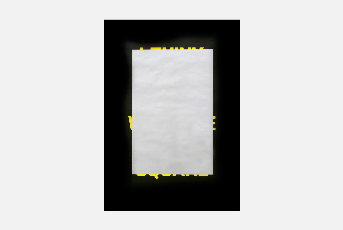
The theme for the Graphic Design Festival Breda 2011 poster exhibition was decoding design. In essence the design process is about making choices. Sometimes though, after putting in a lot of work, you decide to change a design and then come to the conclusion that the initial design worked better. This poster captures that feeling.

Initially, the poster shows a large silver square of scratch-off ink. Prompting people to scratch the ink, text appears from the edges of the square. After taking time to scratch off all the ink the poster reveals: “I think I like it better with the silver square.”


Trapped in Suburbia award

Red Dot Award | 2011 Red Dot Design Award
Short listed | 2011 D&AD award

Hi brand book


Hi is a Dutch telecom company with a target group of young adults. Instead of looking in from the outside, Hi wanted their staff to be part of this world and really live the life of their target group. Therefore the brand book is the diary a young adult full of photos, stickers, concert and train tickets, flyers and a beer mat scrawled with phone numbers. It features several scratch-off ink tests, five fold out pages, a resignation letter (if you fail the scratch tests), many illustrations, UV spot ink and a huge pop-up. You name it; it’s in there!


Trapped in Suburbia award

Finalist | 2010 European Design Awards