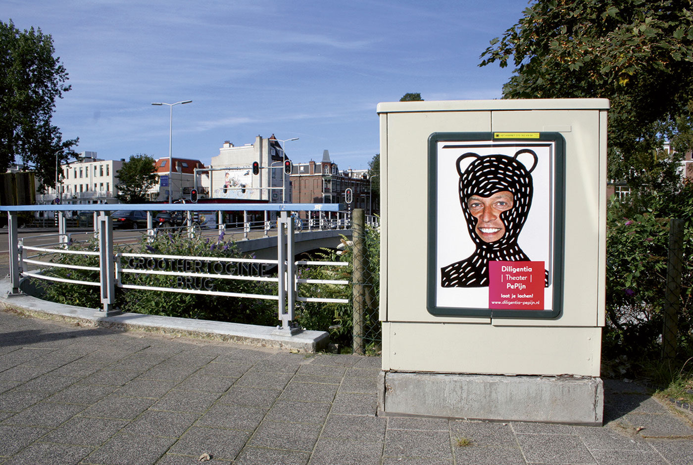
Diligentia Theater

Humour is not always universal. Different people find different things funny yet this poster campaign for comedy theatre Diligentia had to be humorous for many people. Reminded of childhoods spent drawing on photos in gossip magazines this seemed a common experience. This campaign takes that idea to the streets.

Using a portrait of the theatre director a simple poster was designed and printed. Colleagues, fellow designers, friends and students were then invited to join in with the fun. Just like those magazines the posters were customised into unique designs. Over 150 different posters were created and displayed around The Hague.

Escamp

This city lab is a multipurpose talent centre in the Escamp neighbourhood of The Hague. Not only does this design brand the lab but in turn creates an identity for the complete neighbourhood.

Community and togetherness are the foundations of the Escamp identity. The lab was established to break down cultural barriers between and unite different groups living in the neighbourhood. Activities focused around: art, design, media, technology and global cuisine attempt to build a sense of team spirit in the area.

A sports team offers camaraderie and transcends differences just as Escamp wished to achieve. Therefore, the identity uses a bold and unique colour scheme, like a football strip, to build a recognisable brand. This main aspect is then flexible to adapt to illustration, campaigns, signage, stationary and so on.

The identity also plays with the word ‘Escamp’ to highlight the variety of activities on offer at the city lab.

Wie is de nar?

Wie is de nar? (Who is the Fool?) is a festival drawing attention to the importance of the Theater Instituut Nederland (Dutch Theatre Institute). Due to budget cuts, the institute had to make themselves noticed and to do so organised this festival.

The identity is limited to black and white. Not only does this stand out in between all the colourful imagery saturating the streets, it also symbolises the cultural poverty due to the budget cuts. To amplify this, the fool possesses a sinister grin. Inevitably though, from these cuts the cultural scene will grow back stronger.

Wie is de nar? – Spelen met de macht (Who is the fool? – Playing with the power) shows how the role of the fool, or jester, has changed throughout time, both in theatre and every day life. Wie is de nar? attempts to capture the role that the fool plays. Exhibitions, performances (on the street and in the theatre) and debates were all part of the festival.


Trapped in Suburbia award
Finalist | 2013 European Design Awards
Merit | 2013 Hiiibrand Design Award

The real deal


The cover of this book is turned inside out. The design is inside and the endpapers are outside. Het Echte Werk is not printed in regular CMYK. Given the subject of experimentation, cyan, magenta and yellow are replaced by neon PMS inks. However, the book is still printed as normal CMYK printwork giving a completely surprising result and making the photos ‘pop’ with vibrancy.

F.C. de Omslag is a collaboration between the library and archives of Gouda. This initiative was set up to explore and experiment how they, together with the inhabitants of Gouda, can create culture. The book is an adventure into dealing with culture in a new experimental way.

‘De Omslag’ means ‘book cover’ and refers to both the books in the library and the archive. Yet, it also means ‘turning point’, which the team believes this project could mean for them. This is the reason behind the cover being such a focal point. Turning it inside out makes you look twice and that is what F.C. de Omslag is about.


Trapped in Suburbia award

Silver | 2014 European Design Awards | Book Cover
Finalist | 2014 European Design Awards | Book Layout