AnalogFest

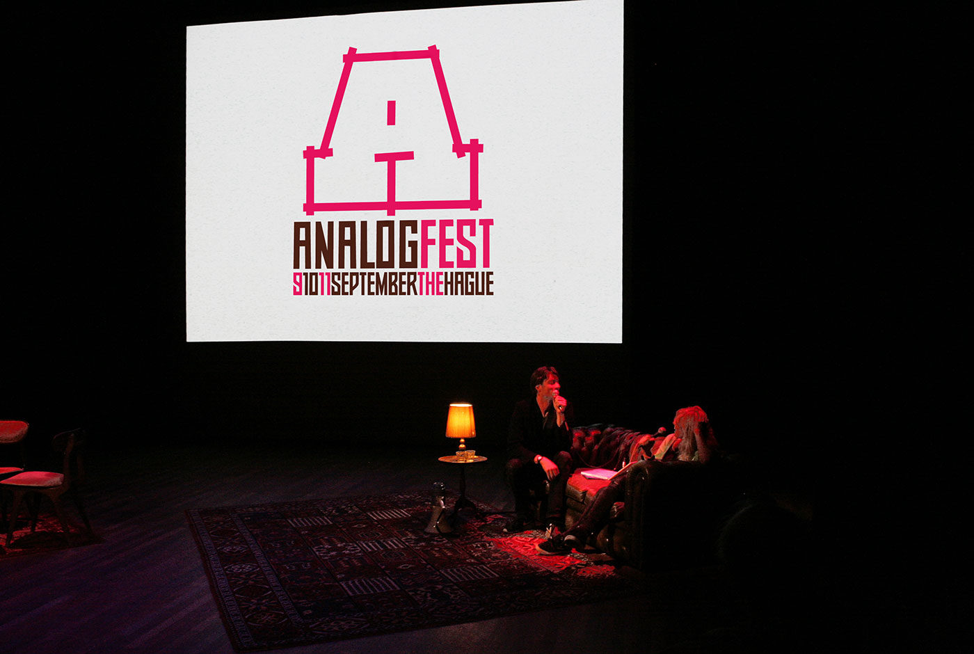
AnalogFest is a festival that celebrates analogue techniques with workshops, exhibitions, pop-up shops, parties and lectures by international artists including Anthony Burrill and Jon Burgerman. The festival would take old techniques and bring them back to life.

For the identity wise old Dutch sayings are designed in an old typeface that is transformed into a quirky modern version. To promote the festival the studio collaborated with local designers to make a large illustration on the venue’s windows.

The website needed of course to be as analogue as possible. Therefore, banners hand painted with the content were taken out into the street and each person presented a different banner in front of existing street webcams. This was recorded and placed into the site. On the site these videos are looped to give the impression of a live feed.


Trapped in Suburbia award

Finalist | 2011 European Design Awards

Sound Posters

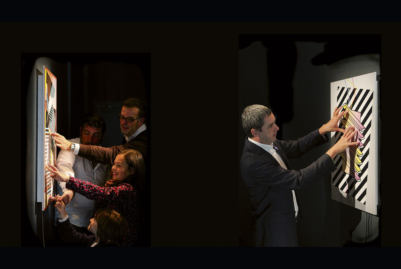
Initiated from the studio’s background in traditional print design and interest in new emerging technology, the Sound Posters are an ongoing research into creating new levels of interaction within the medium of the poster.

Stemming from the desire to involve people more and create new, exciting and memorable experiences, the Sound Posters push the boundaries of conventional print design. The inquiry re-appropriates both new and old technology for different and inventive applications to enhance the poster yet keep it close to its acknowledged form.

Aside from investigating the possibilities, the posters present future developments that combat the argument that ‘print is dead’.

With thanks to David van Gemeren, Alice Stewart, Jiawei van Kleef & Rachel Rosenson.


Trapped in Suburbia award

Silver | 2014 European Design Awards

Ship of Fools

Ship of Fools was a gallery initiated by the studio to showcase graphic art and illustration. At its conception there were no galleries of this kind in the Benelux. Graphic art or illustration was never presented in the ‘white cube’ gallery context, yet it had the quality and skill to be. Ship of Fools presented work from established artists but also new, upcoming artists. Both international and local. It showcased work that was bold, honest and striking.

Ship of Fools helped to build the creative scene in The Hague providing a place holding regular exhibitions where people could go to enjoy new, exciting work. It was a way to share inspiration and talent.

The name Ship of Fools comes from the painting of Hieronymus Bosch, the first real character designer. The painting depicts a ship filled with fools wasting their lives playing cards, drinking, flirting, eating instead of spending it in ‘useful ways.

For now, the gallery is on pause while the studio focuses on the Flags of Peace foundation. An initiative gathering peace flag designs from across the globe in order to exhibit them.

Ship of Fools exhibitions:

2012

Deadorama | Solo exhibition by Mc. Bess

Bring it on! | Group exhibition of more than 50 designers and their favourite works

Trial & Error | Solo exhibition by Brecht Vandenbroucke

Going Places | Solo exhibition by Andy Rementer

Music to My Eyes | Group exhibition with 160 record sleeves

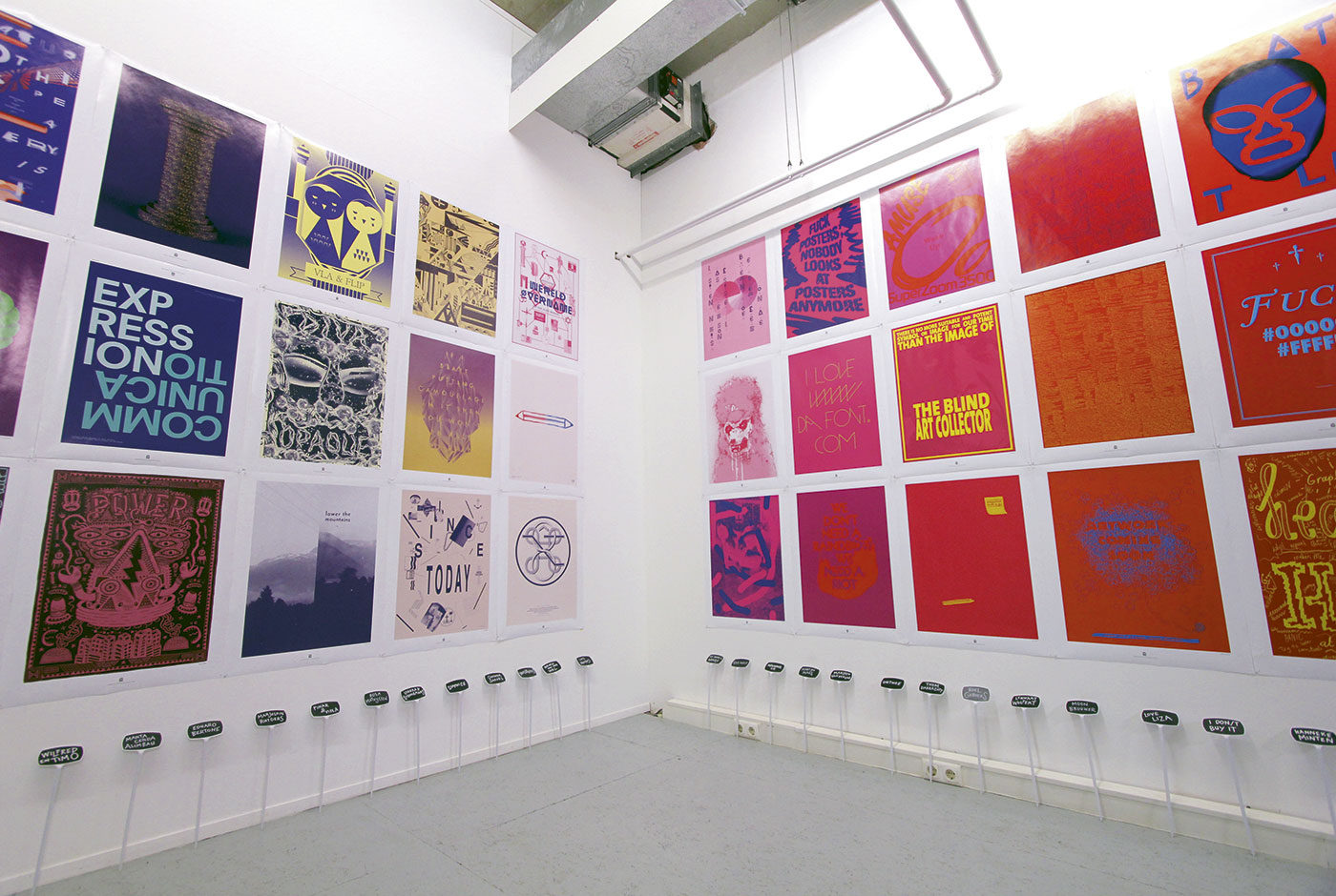
Black and White are not Colors | Group exhibitions of 100 designers and 100 posters in cooperation with fontanel.nl

2011

Really Shit | Solo exhibition by Ian Stevenson

Don’t Believe the Type III | Typography festival with workshops, lectures, exhibition | Niessen en de Vries, Mario Hugo, Sean Freeman, Si Scott, HORT, Jeff Canham, among others

2010

AnalogFest | Festival on analogue techniques with workshops, lectures, exhibition | Jon Burgerman, Anthony Burrill, among others

More is a Bore | Group exhibition on minimalistic graphic design | Buro Destruct, Noma Bar, Leandro Castelao, Gorilla, among others

Summer School | Group exhibition of old school maps | ROA, Ian Stevenson, Merijn Hos, among others

Absurdism is our Religion | Group exhibition on absurdism | Gummbah, Andrew James Jones and Mudwig, among others

Don’t Believe the Type II | Typography festival in Shanghai with workshops, lectures, exhibition | Underware, Trapped in Suburbia, Yomar Augusto, among others

Bode, Botlek, Erosie | Exhibition of Luuk Bode, Daan Botlek & Erosie

2009

Don’t Believe the Type I | Typography festival with workshops, lectures, exhibition | Alex Trochut, Luca Barcellona and Job Wouters, among others

Jackyll & Hyde | Solo exhibition Superoboturbo

You Give Me Fever | Solo exhibition of Erwin van Amstel

Ship of Fools | Opening group exhibition with Jon Burgerman, Andy Rementer, among others

Don’t Believe the Type

Don’t Believe the Type was established as an alternative to existing design festivals. At the time, such festivals were either incredibly expensive, too far away or very traditional, especially when focused on typography. Don’t Believe the Type (DBTT) was an opportunity for inhabitants of the The Hague and surrounding areas to meet other creatives, learn from and be inspired by international leading talents and have some fun, all at an affordable price.

Coinciding with the Ship of Fools gallery (also initiated and run by the studio) the festival featured lectures, workshops and exhibitions. The first edition took place in 2010 in The Hague, after which the festival was invited to the Shanghai World Expo in the same year. For the third and final edition, DBTT returned to The Hague in 2011.

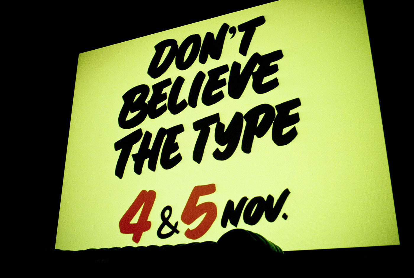
Each edition centred on typography but pushed different themes. The final edition focused on sign painting and following this theme the identity used the talents of traditional Dutch sign painting, cheese signs. In cheese shops across the country and even into Belgium and Germany, hand painted signs adorn the various types of cheeses in thick, black lettering. All the promotion and signage for Don’t Believe the Type 2011 was hand painted by the actual, original cheese shop owner who made this practice notorious.

Don’t Believe the Type has hosted:

Luca Barcellona, Job Wouters, Yomar Augusto, Alex Trochut and Martijn Sandberg, 44 Flavours, Alina Günter, Alex Trochut, Alex Purdy, Andy Rementer, Autobahn, Chris Piascik, Daan Knirim, Hansje van Halem, Janno Hahn, Job Wouters, Jonathan Looman, Lennard Schuurmans, Luca Barcellona, Marta Cerdà Alimbau, Martijn Sandberg & Underware.

Social Signals

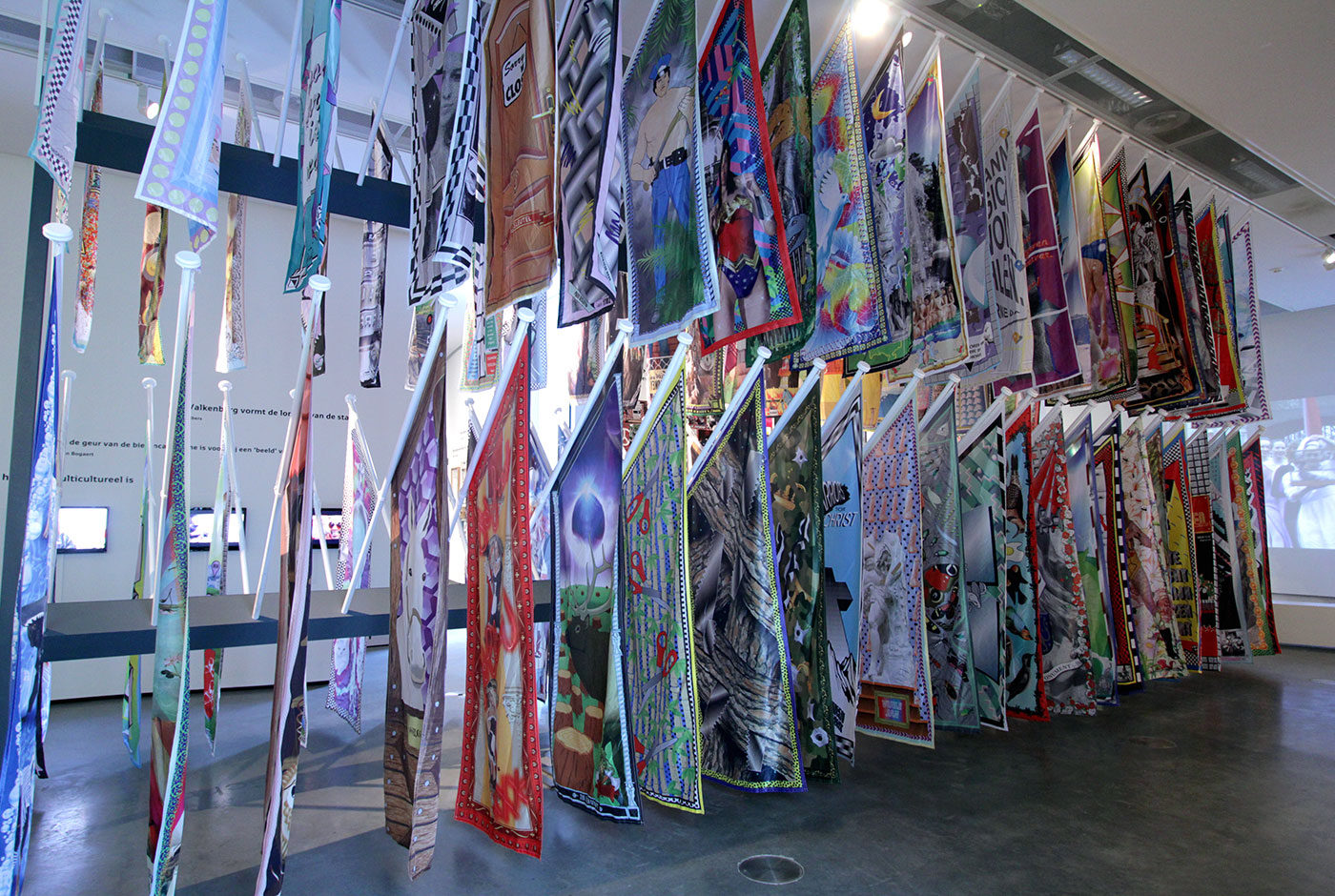
Social signals are used everyday. By ‘liking’ and ‘tweeting’ social media indicates our interests. In 110 flags the Social Signals of Valkenberg Park in Breda are presented as a collaboration between Graphic Design Festival Breda and Trapped in Suburbia. The project explores how the park can be seen as a reflection of society. Information was gathered about the different ways in which Breda’s main park was used by city dwellers. Vakenberg Park is a main artery through the city as everyone has to pass through it on their way to the central station or city centre. In the summer months the park becomes a leisure staple for Breda’s residents. As the park is so widely used by many different people it becomes a micro-society. The data gathered about the park explores how this society functions. Social Signals gives a visual representation of the collected data. The flags are positioned throughout the park and show how important the park is for the city. The flags were also part of the I Love Breda exhibition in the Museum of the Image.

Shy Poster

Expanding the Sound Poster series, the Shy Poster furthers this inquiry into new experiences with the traditional poster medium.

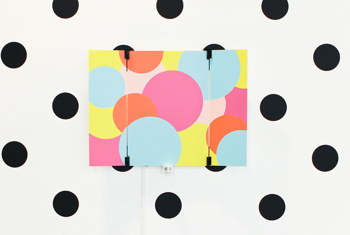
This time the poster gains personality by personifying shyness in an interactive installation. If the poster is left alone its colourful inner character is revealed. However, if someone interrupts this personal comfort zone the poster immediately retracts its doors hiding itself within the conformity of its background.

Providing the new visitor is patient and tactful, the Shy Poster will become comfortable and slowly reveal its true personality. Yet, you must be careful…

Any large movements are detected by motion sensors which trigger the doors to slam shut!

With special thanks to Alice Stewart and Jiawei van Kleef.

Flags of Peace

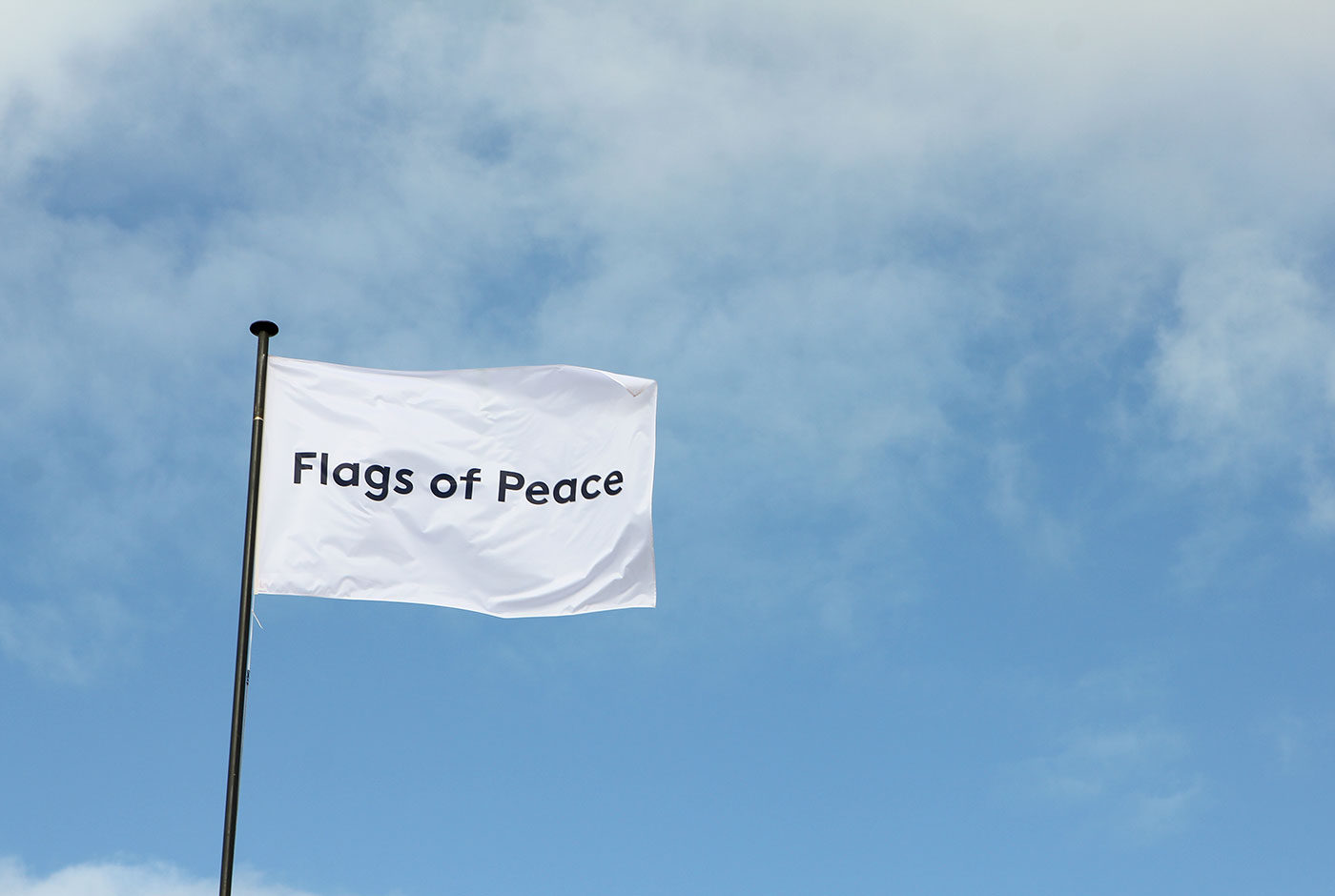
Throughout history there have been several attempts to establish a peace flag. A universal collection of symbols exist that we associate with peace yet no single peace flag has gained complete international recognition and permanence. What defines peace? How could it be symbolised? And what can a peace flag achieve?

With this project the studio seeks to answer these questions. The project aims to gather a flag design from every nation in the world. Through contributions from both established and young talented designers, artists and other creatives it creates a visual dialogue around peace and its symbolism. Together the flags form a traveling exhibition and present a global spectrum of ideas on peace, each highlighting particular relationships and views towards the topic.

Art and design can be a binding factor between people, cultures and countries. It can contribute to better communication between individuals, close gaps and help work towards a more peaceful world.

Flags of Peace is a work in progress, more flags are still to come.

flagsofpeace.com


Trapped in Suburbia award

Bronze | 2015 European Design Awards

Decoding Design

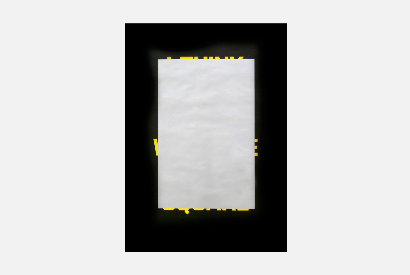
The theme for the Graphic Design Festival Breda 2011 poster exhibition was decoding design. In essence the design process is about making choices. Sometimes though, after putting in a lot of work, you decide to change a design and then come to the conclusion that the initial design worked better. This poster captures that feeling.

Initially, the poster shows a large silver square of scratch-off ink. Prompting people to scratch the ink, text appears from the edges of the square. After taking time to scratch off all the ink the poster reveals: “I think I like it better with the silver square.”


Trapped in Suburbia award

Red Dot Award | 2011 Red Dot Design Award
Short listed | 2011 D&AD award

Diligentia Theater

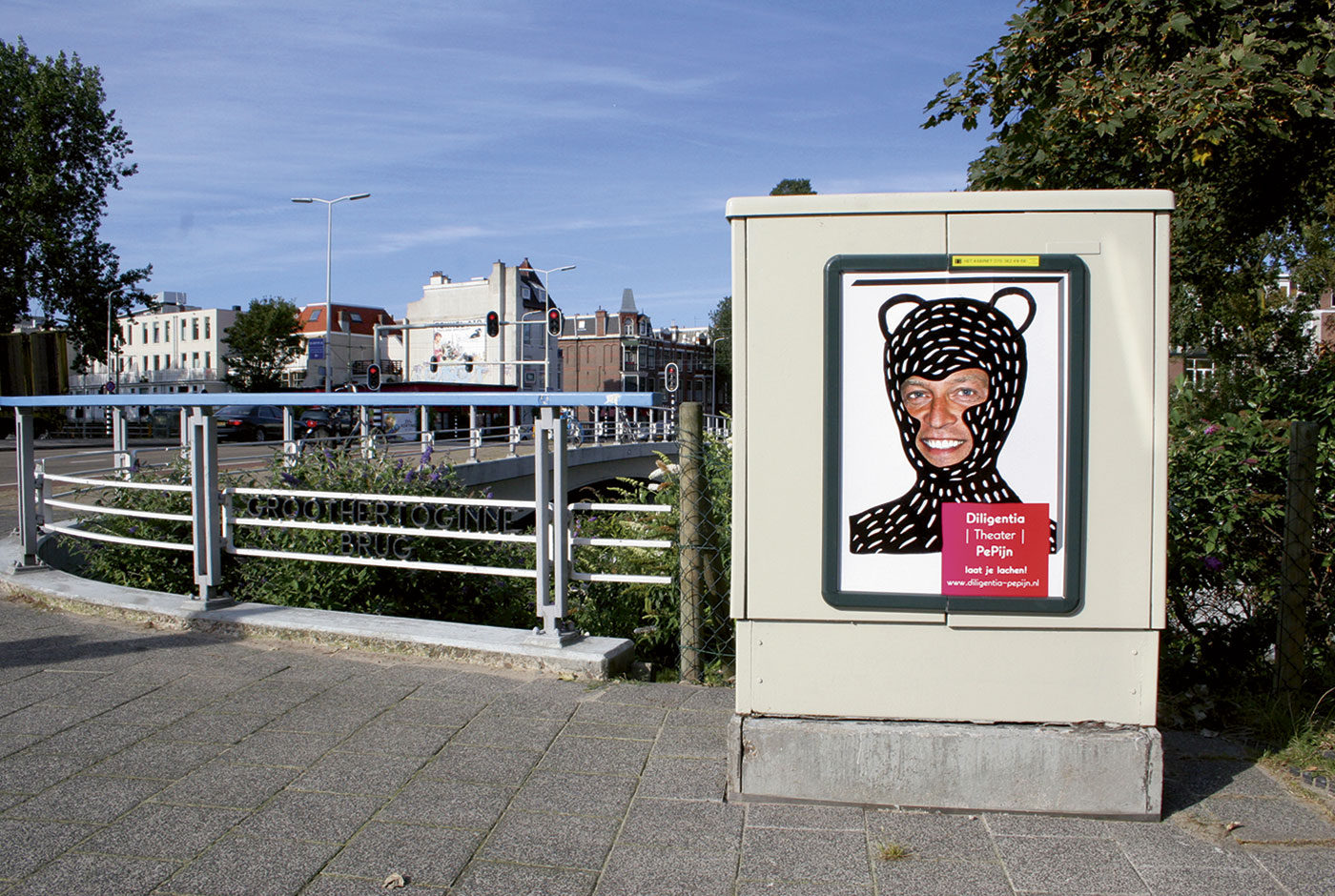
Humour is not always universal. Different people find different things funny yet this poster campaign for comedy theatre Diligentia had to be humorous for many people. Reminded of childhoods spent drawing on photos in gossip magazines this seemed a common experience. This campaign takes that idea to the streets.

Using a portrait of the theatre director a simple poster was designed and printed. Colleagues, fellow designers, friends and students were then invited to join in with the fun. Just like those magazines the posters were customised into unique designs. Over 150 different posters were created and displayed around The Hague.

Aim for the Day

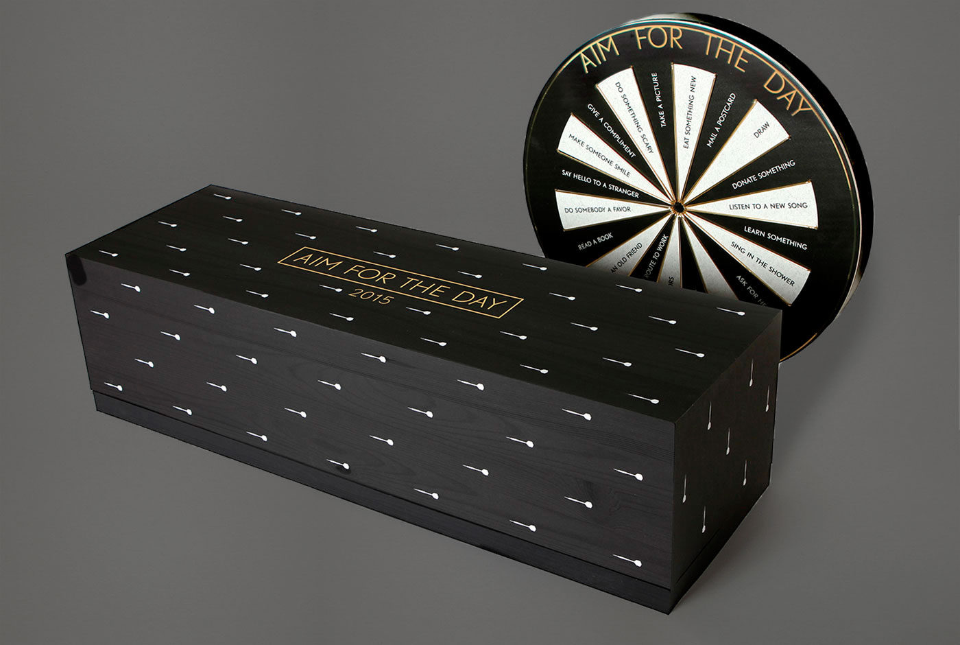
Aim for the Day is a calendar with ambition. This quality constructed piece is composed of a dartboard and chest containing 365 individually dated darts. Rather than the traditional scoring pattern, the dartboard’s segments present an aim for the day – ‘Do something scary’, ‘Take a new route to work’, ‘Learn something’… Each day the user throws a dart and depending on where it lands, a new aim is given.

This calendar encourages the user to break free from routine, discover new experiences and develop a sense of achievement and happiness throughout their day-to-day life.

After one year the complete dartboard becomes a showcase of 365 achievements giving the user a great sense of satisfaction and accomplishment.


Trapped in Suburbia award
Silver | 2015 International Design Awards