Jaap Drupsteen Designer Explorer


Jaap Drupsteen, legendary Dutch designer/video artist was revolutionary in the use of chroma keying, also know as the blue screen effect. This technique allowed him to superimpose actors or elements into totally different environments.

An accompanying app allows the reader to experience chroma keying firsthand. The app contains a library of video clips from Drupsteen’s productions that can be superimposed onto the solid blue book, thus bringing the monograph to life whilst explaining his process.

Video productions form the majority of Drupsteen’s oeuvre meaning every second holds a uniquely beautiful graphic image. Unlike the traditional graphic designer, Drupsteen creates twenty-five incredible images per second.

Consequently, the inside pages present over 400 stills rarely seen as individual frames, revealing their incredible colour and detail, emphasised by the fact many were created before the use of computers.

Download Jaap Drupsteen from the Apple App Store.

This book was part of the exhibition Jaap Drupsteen – Designer | Explorer  that we also designed.

The Twenty Year Yourney


Eurocontrol are responsible for the air-traffic management and regulation across the entire European airspace. This is an overwhelmingly complex task with a huge amount of responsibility and information. The Twenty-Year Journey marks the organisation’s anniversary and through clear infographics presents its detailed history in an easily comprehendible manner. Fold out pages accentuate certain infographics for maximum impact.

The book was presented to employees and associates in two hardcover editions. The standard edition is covered with grey linen and a limited special edition features a white leather cover with gold foiled text and edges.

Considering its enormous task and responsibility the Eurocontrol headquarters retains a calm, peaceful and controlled atmosphere. This is captured through a series of commissioned photographs included throughout the publication.

Graphic Happiness I


Graphic Happiness consists of a publication, traveling exhibition and educational programme covering 100 years of Dutch graphic design. Travelling through China the exhibition showed work of over 60 designers highlighting their love of design. 

Based on the Chinese symbol of ‘double happiness’ and the Dutch flag (red, white and blue) the logo symbolises the two countries uniting in design. The logo is divided and produced as three different straps which hold together the exhibition furniture and bind the publication. The logo is literally and metaphorically the binding factor in the whole design.

The publication consists of 246 loose pages presenting work by Dick Bruna, Wim Crouwel, Theo van Doesburg, Anthon Beeke, Lust, Thonik, Niessen & de Vries, Studio Dumbar, Trapped in Suburbia among others.

Graphic Happiness is available from Museum Hilversum for €32,50 as a bilingual English/Chinese edition.


Trapped in Suburbia award

Silver | 2013 European Design Awards
Bronze | 2013 International Design Awards
Bronze | 2012 Hiiibrand Awards

Where there is smoke…


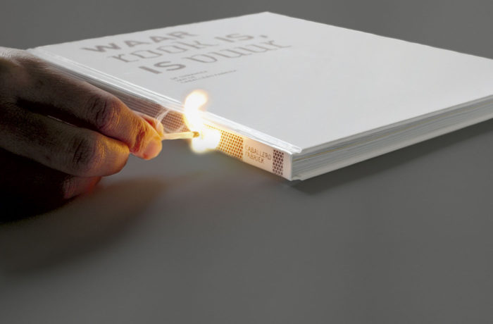
Waar rook is, is vuur (Where There is Smoke, is Fire) is a publication about the old Caballero Cigarette factory, which has been transformed into a creative work area. Where once cigarettes were made now architects, photographers, industrial designers, graphic designers and web designers carry out creative projects.

The spine and typography on the cover are silkscreen printed with a matchbox structure so you can actually strike a match on the book. Inside, several kinds of paper are use to represent the different architectural surfaces throughout the building.


Trapped in Suburbia award

Silver | 2010 European Design Awards

Graphic Happiness II


The catalogue accompanying Grafisch Geluk (Graphic Happiness), an exhibition of 100 years of graphic design, tells the story of one specific part to Dutch design history. This is de Jong, one of the most famous Dutch printers. They were the first to work really close with designers like Wim Crouwel, Dick Bruna, Anthon Beeke and Otto Treuman and carried out all kinds of experiments that are now considered standard printing techniques.

The cover of the book consists of five loose covers that together form the logo of the printer, de Jong. This symbolises the special collaboration between the printer and the designer, working together they produced their best designs.


Trapped in Suburbia award

Silver | 2012 International Design Awards

The real deal


The cover of this book is turned inside out. The design is inside and the endpapers are outside. Het Echte Werk is not printed in regular CMYK. Given the subject of experimentation, cyan, magenta and yellow are replaced by neon PMS inks. However, the book is still printed as normal CMYK printwork giving a completely surprising result and making the photos ‘pop’ with vibrancy.

F.C. de Omslag is a collaboration between the library and archives of Gouda. This initiative was set up to explore and experiment how they, together with the inhabitants of Gouda, can create culture. The book is an adventure into dealing with culture in a new experimental way.

‘De Omslag’ means ‘book cover’ and refers to both the books in the library and the archive. Yet, it also means ‘turning point’, which the team believes this project could mean for them. This is the reason behind the cover being such a focal point. Turning it inside out makes you look twice and that is what F.C. de Omslag is about.


Trapped in Suburbia award

Silver | 2014 European Design Awards | Book Cover
Finalist | 2014 European Design Awards | Book Layout

Innovation in Dance


Movement and rhythm are central to the identity of Fresh Tracks Europe. Innovation in Dance for Young Audiences presents the philosophy and projects of this youth dance network in a publication that embodies dance.

Six cover variations, showing shapes taken from the identity, are choreographed as a stop motion animation adding motion and rhythm to the usually static printed object.

There is more than one truth


VJ Movement gives journalists and cartoonists around the world the opportunity to share their stories and tell their truths. They reveal subjects and perspectives that aren’t covered in mainstream news.

Anyone can pitch their untold story to VJ Movement and if it receives enough votes a professional VJ Cartoonist will report on this and publish it online. The best cartoons are collated in this book. Removing the translucent red band allows the reader to reveal these other truths for themselves.

Knowledge economy monitor


This publication written by Kennisland (Knowledgeland) shows the situation in Dutch society regarding the future. Kenniseconomie Monitor 2010 (Knowledge Economy Monitor 2010) discusses in detail the value in strengthening knowledge to guarantee future prosperity and welfare.

As well as thorough reports, over ninety infographics printed in five fluorescent colours summarise the facts clearly and informatively throughout the book.

Amsterdam Opportunity zones


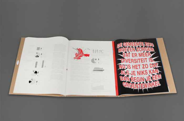
This publication shows the results of a study by the Hogeschool van Amsterdam (Amsterdam University of Applied Sciences), on the grant programme Amsterdam Kansenzones (Amsterdam Opportunity Zones). The programme provides financial opportunities for small independent retailers.

The study revealed a lack of understanding between the municipality and the shopkeepers. This dispute manifests as two booklets. One uses the visual language of the shopkeepers to express their views. The other shows the research result in the classic, formal language of the municipality.

The two booklets are interweaved meaning the reader has to consider both sides of the conversation turning a page at a time. Due to friction the two booklets cannot be pulled apart when closed highlighting the dependency these two parties have on each other.

The large A3 format stems from the researcher’s desire to make the report visible and not to be placed in a drawer never to be read.


Trapped in Suburbia award

Bronze | 2013 European Design Awards