Don’t Believe the Type
Don’t Believe the Type was established as an alternative to existing design festivals. At the time, such festivals were either incredibly expensive, too far away or very traditional, especially when focused on typography. Don’t Believe the Type (DBTT) was an opportunity for inhabitants of the The Hague and surrounding areas to meet other creatives, learn from and be inspired by international leading talents and have some fun, all at an affordable price.
Coinciding with the Ship of Fools gallery (also initiated and run by the studio) the festival featured lectures, workshops and exhibitions. The first edition took place in 2010 in The Hague, after which the festival was invited to the Shanghai World Expo in the same year. For the third and final edition, DBTT returned to The Hague in 2011.
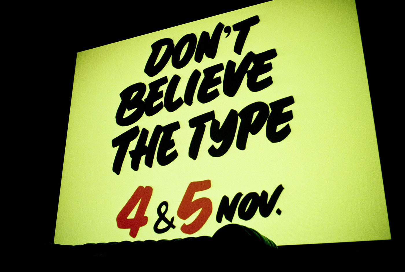
Each edition centred on typography but pushed different themes. The final edition focused on sign painting and following this theme the identity used the talents of traditional Dutch sign painting, cheese signs. In cheese shops across the country and even into Belgium and Germany, hand painted signs adorn the various types of cheeses in thick, black lettering. All the promotion and signage for Don’t Believe the Type 2011 was hand painted by the actual, original cheese shop owner who made this practice notorious.
Don’t Believe the Type has hosted:
Luca Barcellona, Job Wouters, Yomar Augusto, Alex Trochut and Martijn Sandberg, 44 Flavours, Alina Günter, Alex Trochut, Alex Purdy, Andy Rementer, Autobahn, Chris Piascik, Daan Knirim, Hansje van Halem, Janno Hahn, Job Wouters, Jonathan Looman, Lennard Schuurmans, Luca Barcellona, Marta Cerdà Alimbau, Martijn Sandberg & Underware.


