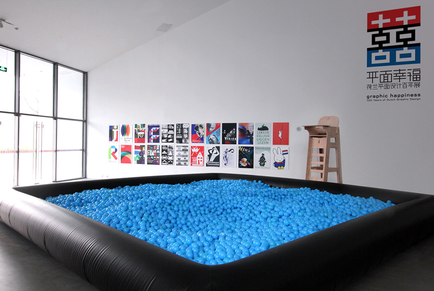
Graphic Happiness – 100 Years of Dutch Graphic Design
Graphic Happiness consists of a publication, traveling exhibition and educational programme covering 100 years of Dutch graphic design. Travelling through China the exhibition showed work of over 60 designers highlighting their love of design.
A key part of the exhibition is the ball pit, which symbolises that the Netherlands lies below sea level. Due to the historic struggle with water, the Dutch had to be extremely inventive for hundreds of centuries. They had to design their environment in order to survive. From this necessity comes the Dutch theory that everything can be designed and forms the base to the distinctive, playful and clear Dutch design that is world-renowned. Each blue ball shows a portrait of a legendary Dutch designer or one of their designs so you can literally dive into Dutch design history.
The exhibition shows the work of over 60 designers and shows their love and passion for graphic design. Design is what makes these designers happy. It also bring the two countries, China and the Netherlands together, in an exchange of design knowledge and culture.
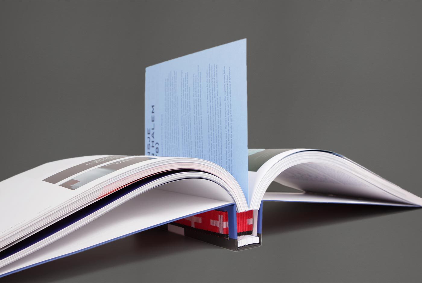
Based on the Chinese symbol of ‘double happiness’ and the Dutch flag (red, white and blue) the logo symbolises the two countries uniting in design. The logo is divided and produced as three different straps, which hold together the exhibition furniture and bind the publication. The logo is literally and metaphorically the binding factor in the whole design.
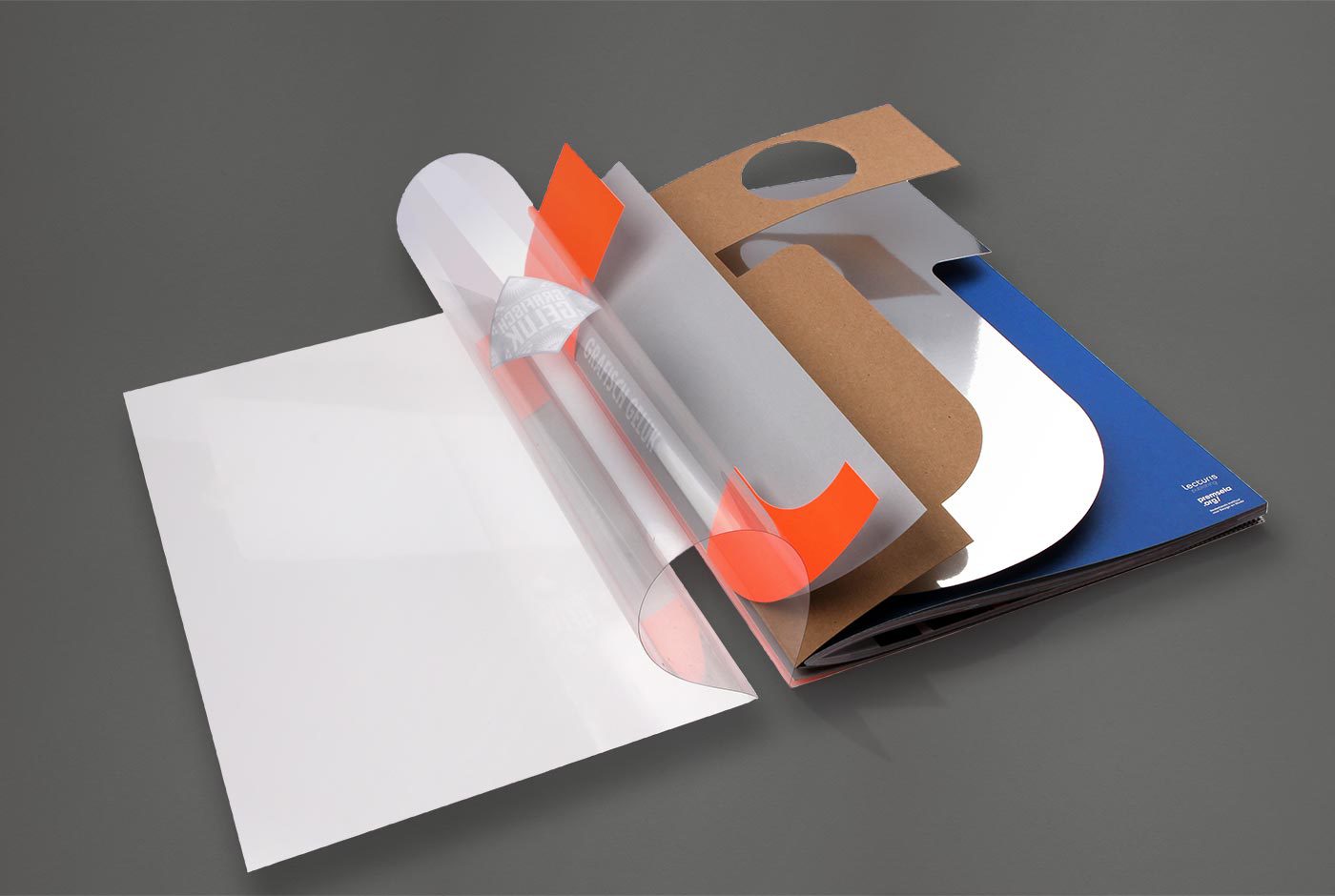
The flat pack furniture construction in combination with the strap fixtures provided an easily assembled solution for a travelling exhibit.