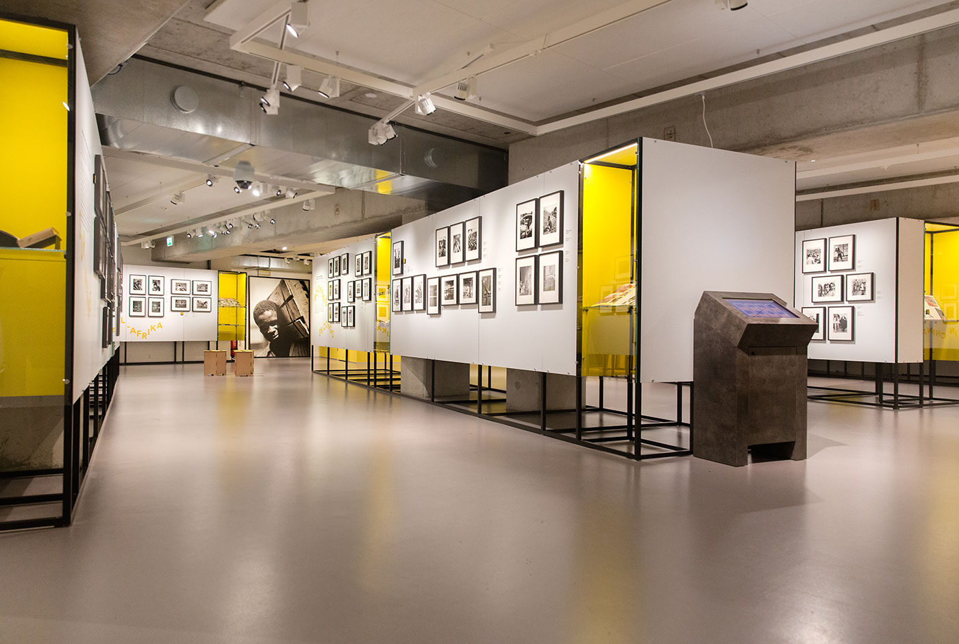
Hague Talks

Hague Talks is an international travelling meeting place for creative minds, peace inventors and game changers in the field of peace and justice.

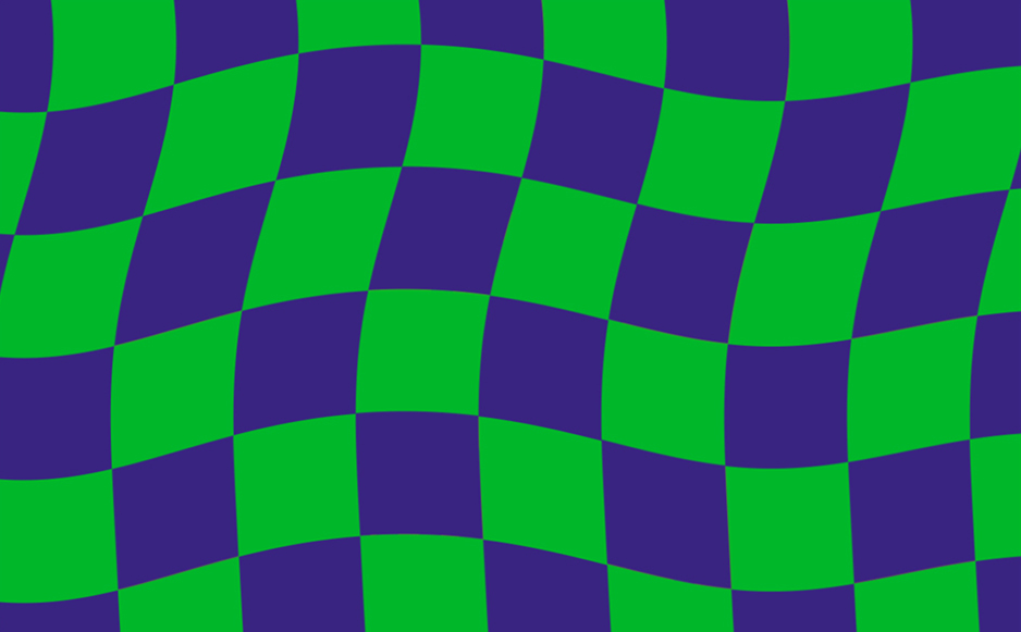
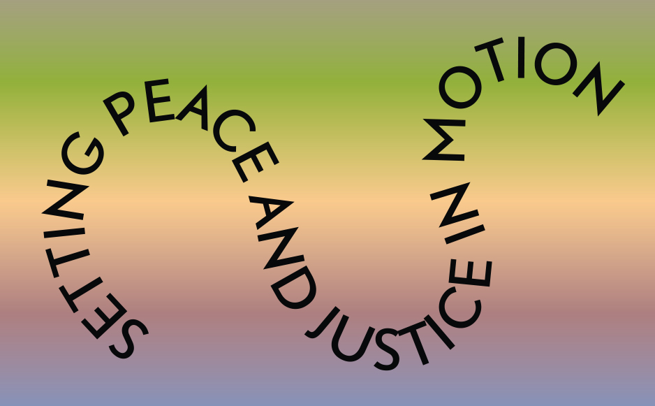
The first Hague Talks event took place at the Peace Palace in The Hague and future events will travel to New York, South Africa and further. For each location the colour scheme is created from the prominent colours of that particular place. Therefore, each location has its own identity.

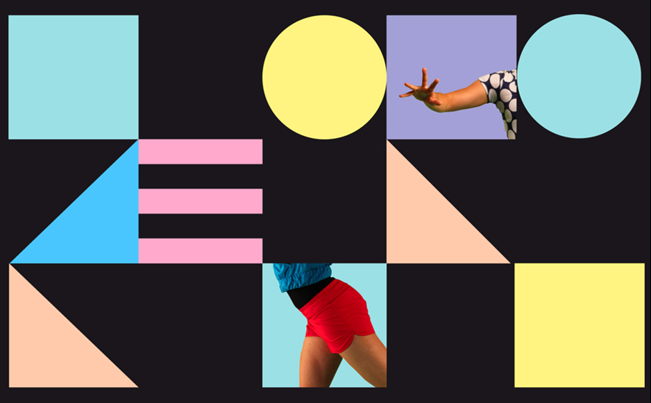
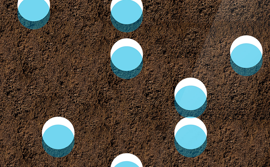
The logo represents the start of the peace process and the chain reaction that follows. This chain reaction is also translated into the moving typography which can be found throughout the whole identity.

Hague Talks is a stage and breeding place for new ideas and perspectives, a forum for discussion and a starting point for concrete action. It is the platform that sets the ball rolling on the idea of gaining peace and justice.

haguetalks.com


Trapped in Suburbia award
Bronze | 2015 Hiiibrand Awards

Escamp

This city lab is a multipurpose talent centre in the Escamp neighbourhood of The Hague. Not only does this design brand the lab but in turn creates an identity for the complete neighbourhood.

Community and togetherness are the foundations of the Escamp identity. The lab was established to break down cultural barriers between and unite different groups living in the neighbourhood. Activities focused around: art, design, media, technology and global cuisine attempt to build a sense of team spirit in the area.

A sports team offers camaraderie and transcends differences just as Escamp wished to achieve. Therefore, the identity uses a bold and unique colour scheme, like a football strip, to build a recognisable brand. This main aspect is then flexible to adapt to illustration, campaigns, signage, stationary and so on.

The identity also plays with the word ‘Escamp’ to highlight the variety of activities on offer at the city lab.

Fresh Tracks Europe

Fresh Tracks Europe is a youth dance network for a new generation of choreographers. Their identity is based on a set of dancing body parts and coloured shapes. Dancers from the various groups actually become part of their own identity.

These building blocks form an identity with lots of room to play. The blocks symbolise the philosophy of Fresh Tracks Europe in which the different European dance groups work together to create a new dance generation.

The flexibility in the design means the identity is dynamic it has rhythm and movement. The identity itself can dance.


Trapped in Suburbia award
Silver | 2012 European Design Awards
Silver | 2012 International Design Awards
Finalist | 2013 Hiiibrand Design Award

Driiip

Three circles in the Driiip identity represent the stages and elements to drip irrigation – water, life and earth. Drip irrigation is an extremely precise and water conserving method of irrigation which slowly releases droplets of water directly to the root over a long period.

These three elements return throughout the identity in graphic illustrations of the process and photography of luscious greenery. Placement of these also play with the physicality of materials such as earth that lies on the bottom of the letterhead.


Trapped in Suburbia award

Bronze | 2016 Hiii Brand Awards

On The Road – Travelling with the Photographer

How can photography be experienced in a new way? On The Road – Travelling with the Photographer marks the first in a series of exhibitions showcasing the National Archive’s photography collection of over 14 million images. The selection is a journey through history showing the prominence of travel in the development of photography.

Since this is the first in a series of exhibitions, the entire structural design is a modular system that can be easily deconstructed and rebuilt in different layouts for future exhibits. In addition we’ve designed a unique hanging system that is flexibel, safe, 80% faster and does not damage the walls.

Additional photos by Anne Reitsma