VPRO Annual Review

The theme of this VPRO annual review 2019 is Future Builders. Shaping and wanting to help build the future is a fixed value in the stories and programs of the VPRO. During the Dutch Design Week, VPRO already collected future questions from the public. Questions that VPRO should work with, whether for research or otherwise. It yielded them many hundreds of responses, written on large colored cards.

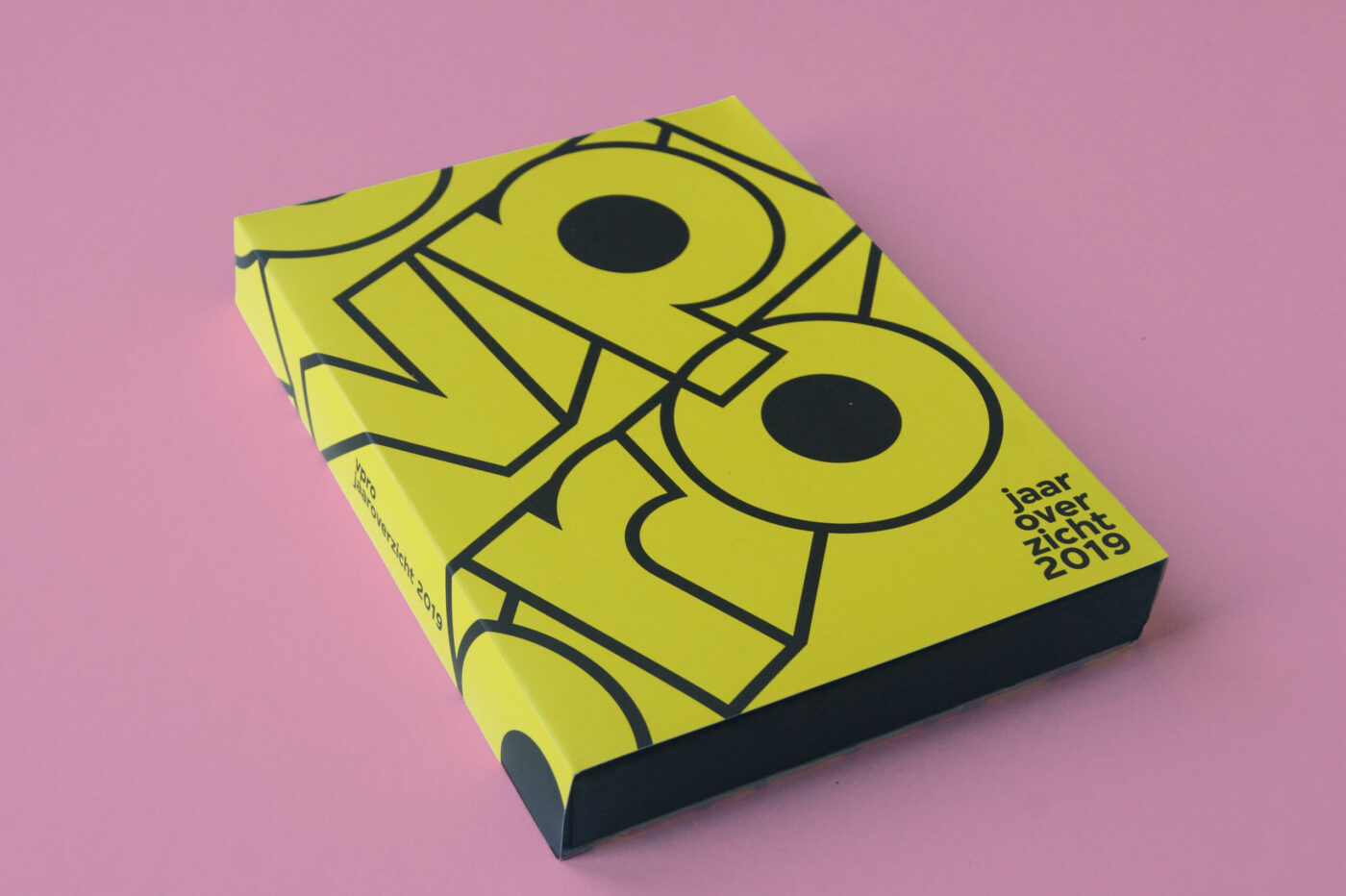
These cards were the inspiration for the design of the annual overview. Not a bound book, but a stubborn box with loose cards. With a bit of a nod to the old-fashioned videotape. The first card is a blank card for members to send their own future question to the VPRO.

Diligentia Theater

Humour is not always universal. Different people find different things funny yet this poster campaign for comedy theatre Diligentia had to be humorous for many people. Reminded of childhoods spent drawing on photos in gossip magazines this seemed a common experience. This campaign takes that idea to the streets.

Using a portrait of the theatre director a simple poster was designed and printed. Colleagues, fellow designers, friends and students were then invited to join in with the fun. Just like those magazines the posters were customised into unique designs. Over 150 different posters were created and displayed around The Hague.

Escamp

This city lab is a multipurpose talent centre in the Escamp neighbourhood of The Hague. Not only does this design brand the lab but in turn creates an identity for the complete neighbourhood.

Community and togetherness are the foundations of the Escamp identity. The lab was established to break down cultural barriers between and unite different groups living in the neighbourhood. Activities focused around: art, design, media, technology and global cuisine attempt to build a sense of team spirit in the area.

A sports team offers camaraderie and transcends differences just as Escamp wished to achieve. Therefore, the identity uses a bold and unique colour scheme, like a football strip, to build a recognisable brand. This main aspect is then flexible to adapt to illustration, campaigns, signage, stationary and so on.

The identity also plays with the word ‘Escamp’ to highlight the variety of activities on offer at the city lab.

Love Life Festival

Love Life Festival was organised to raise safe sex awareness amongst younger inhabitants of The Hague. The campaign’s strong visual identity places the heart as the most important role. The heart symbolises two people having sex, becoming one, but remaining separate by protecting themselves. Aids and other STDs effect all sorts of people, no matter their social background or sexual preferences. Consequently, the colour scheme is free from associations, only the reference to nightlife where the majority of the target audience is found.

Visuals are accompanied by witty short copy provoking visitors to smile but also think about the important subject. This is a different and new approach to bringing the message of safe sex because merely scaring people just does not work. Humour can help discuss these tricky subjects. For instance, a tram that reads “Take me, take me now!”, toilet stickers that read “Make me wet”, crew shirts that read “(s)crew” or for the bar crew “I can make you come twice”, mirror stickers that read “Mirror, mirror on the wall, who is the sexiest of them all?”, free cards that scream “Take me!” and promotion teams with billboards that display “If you like my back, you should check the front”.

The festival also included the One Night Stand Up Comedy and a dance event called I’m Gonna Make You Sweat.

Wie is de nar?

Wie is de nar? (Who is the Fool?) is a festival drawing attention to the importance of the Theater Instituut Nederland (Dutch Theatre Institute). Due to budget cuts, the institute had to make themselves noticed and to do so organised this festival.

The identity is limited to black and white. Not only does this stand out in between all the colourful imagery saturating the streets, it also symbolises the cultural poverty due to the budget cuts. To amplify this, the fool possesses a sinister grin. Inevitably though, from these cuts the cultural scene will grow back stronger.

Wie is de nar? – Spelen met de macht (Who is the fool? – Playing with the power) shows how the role of the fool, or jester, has changed throughout time, both in theatre and every day life. Wie is de nar? attempts to capture the role that the fool plays. Exhibitions, performances (on the street and in the theatre) and debates were all part of the festival.


Trapped in Suburbia award
Finalist | 2013 European Design Awards
Merit | 2013 Hiiibrand Design Award

Just Peace

justpeacethehague.com


Trapped in Suburbia award

Gold | 2015 International Design Award

Fresh Tracks Europe

Fresh Tracks Europe is a youth dance network for a new generation of choreographers. Their identity is based on a set of dancing body parts and coloured shapes. Dancers from the various groups actually become part of their own identity.

These building blocks form an identity with lots of room to play. The blocks symbolise the philosophy of Fresh Tracks Europe in which the different European dance groups work together to create a new dance generation.

The flexibility in the design means the identity is dynamic it has rhythm and movement. The identity itself can dance.


Trapped in Suburbia award
Silver | 2012 European Design Awards
Silver | 2012 International Design Awards
Finalist | 2013 Hiiibrand Design Award