Weer Toekomst!

This travelling exhibition presents the story of refugee integration through the photographs of Ahmet Polat, Dutch photography laureate of 2015. The exhibition travels throughout the Netherlands to various venues including museums and universities, consequently the design is formed from a collection of installations able to adapt to the different environments. The various panels present photos, written stories and recorded interviews of each refugee.

An important part of the exhibition is the calendar wall. Each calendar represents one year in the life of a refugee while staying in the Netherlands. The sheets of each calendar can be torn off and taken home to create a do-it-yourself exhibition.   

Polat followed several students of UAF, the Foundation for Refugee Students who support highly skilled refugees in the Netherlands by helping with their study and transferring their existing qualifications into acknowledged Dutch ones. The photographs and accompanying stories capture the process of integration for these various individuals and document their new future in the Netherlands.

The name Weer Toekomst sheds a positive light on the new futures for these individuals, especially when ‘future’ can be an uncertainty for refugees.

Cover! – 85 Years of VPRO Gids Covers

Cover! marks 85 years of VPRO Gids, the television guide of Dutch broadcast station VPRO. This particular broadcast station has played a crucial part in Dutch design history with the guide being a focal point.

This exhibition at the Museum of the Image in Breda was a tribute to this magnificent series of publications. The VPRO were one of the early commissioners of talented designers and artists to design their covers.

Medieval basement

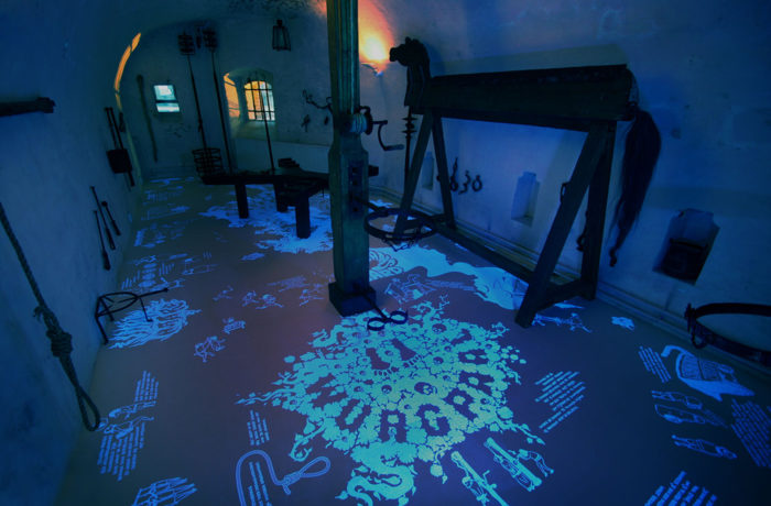
The redesign of this medieval exhibit in Museum Gouda focused on capturing the imagination and curiosity children had when entering but also making it exciting and informative. Translating all the information into UV illustrations means that to the naked eye nothing is visible. Only with the use of a UV torch can the visitor explore the space and discover facts and stories about the equipment hidden all over the floor. Shining a light on the dark history of the middle ages. Thus placing the visitor in the mindset of this curious, imaginative child and forcing them to search around.


Trapped in Suburbia award

Gold | European Design Awards
Silver | International Design Awards

Jaap Drupsteen – Designer | Explorer

To celebrate fifty-years as a practicing designer, Museum Hilversum held a retrospective exhibition on the work of Jaap Drupsteen. The exhibition showcases Jaap Drupsteen fruitful career and divides this into three sections.

The top floor presents his early audiovisual design (VPRO, Hadimassa etc) and printed objects (money, passport etc). Being a designer for screen, Drupsteen naturally starts working on black, hence the visitor enters a completely black space displaying only video work. After this the visitors moves to white – print work. Also on show are the original title rolls, all made by hand, inspiring a scrolling intro wall.

Since the exhibition features a large amount of video work a special audio system, the Sennheiser guidePORT, is used.  With the headphones on the user walks towards a screen or into a particular area and the audio is automatically heard. This prevents multiple audio tracks clashing and turning the exhibition space into musical chaos.

The Music Theatre is the second floor and displays many of Drupsteen’s theatre productions he created specifically for television. To create these unusual and inventive productions he became revolutionary in his use of chroma keying – the blue/green screen effect. To demonstrate this the visitor can experience live chroma keying by standing in a blue screen area and magically being positioned into one of Drupsteen’s works.

The lower floor presents his most recent work through two large scale projections. These are audiovisual compositions created for DJ and orchestral visuals and use a software developed by Drupsteen himself to achieve a perfect sync between image and sound.

Graphic Happiness – 100 Years of Dutch Graphic Design

Graphic Happiness consists of a publication, traveling exhibition and educational programme covering 100 years of Dutch graphic design. Travelling through China the exhibition showed work of over 60 designers highlighting their love of design.

A key part of the exhibition is the ball pit, which symbolises that the Netherlands lies below sea level. Due to the historic struggle with water, the Dutch had to be extremely inventive for hundreds of centuries. They had to design their environment in order to survive. From this necessity comes the Dutch theory that everything can be designed and forms the base to the distinctive, playful and clear Dutch design that is world-renowned. Each blue ball shows a portrait of a legendary Dutch designer or one of their designs so you can literally dive into Dutch design history.

The exhibition shows the work of over 60 designers and shows their love and passion for graphic design. Design is what makes these designers happy. It also bring the two countries, China and the Netherlands together, in an exchange of design knowledge and culture.

Based on the Chinese symbol of ‘double happiness’ and the Dutch flag (red, white and blue) the logo symbolises the two countries uniting in design. The logo is divided and produced as three different straps, which hold together the exhibition furniture and bind the publication. The logo is literally and metaphorically the binding factor in the whole design.

The flat pack furniture construction in combination with the strap fixtures provided an easily assembled solution for a travelling exhibit.


Trapped in Suburbia award
2x Silver | International Design Awards
Brons | International Design Awards
Bronze | Hiiibrand Design Award

Grafisch Geluk

Grafisch Geluk (Graphic Happiness) presents 100 years of Dutch graphic design. It showcases the work of Wim Crouwel, Dick Bruna, Anthon Beeke, Otto Treuman and many more. The exhibition looks into designers trying to find happiness in their work, in graphic design.

Outside of design many people search for happiness in Las Vegas. The city has become synonymous with the idea. Inspired by the signs of Las Vegas the complete exhibition signage system is made from light boxes, turning the space into a dazzling display of iconic work and literally illuminating design history.

All the signage is black and white not to conflict with the vast array of colourful work on show.

Trapped in Suburbia award

Silver | International Design Awards

Design it Yourself

Design It Yourself is an interactive exhibition at the former Graphic Design museum in Breda. In the exhibition both children and adults are challenged to work as designers by the use of large moving blocks. There are different elements for them to design such as: a magazine cover, a stop motion animation, a T-shirt or an icon.

Trapped in Suburbia award

Silver | International Design Awards
Finalist | European Design Awards

Room to play


Ruimte voor de spelende mens (Room to play) presents The Hague’s dream to become a utopian city based on artist Constant Nieuwenhuys’ New Babylon. Here the city is an environment where its inhabitants can focus solely on their creativity and exist as homo ludens, ‘playing man’.

This financial report documents the cultural budget distribution across the many institutions in The Hague. The document details the government’s spending for the following four years in comparison to previous.

Fulfilling the city’s dream, the design of the report actually gives the reader the opportunity to play. The content is divided into seven books which form a tangram puzzle. ‘Alles moet mogelijk blijven, alles moet kunnen gebeuren’ (Everything must remain possible, everything can happen), the report’s ethos, is emphasised through the tangram’s ability to form infinite combinations.

As a tangram puzzle the previously dry and complex document is transformed into one of creativity and joy. Additionally, the shapes of the tangram become an abstraction of The Hague’s visual identity of which the report is designed within.

This is Experience Design


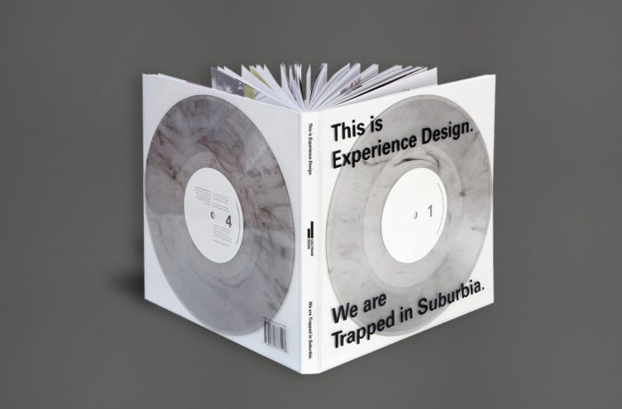
Our monograph This is Experience Design showcases the studio’s work from the past thirteen years and explains the theory behind Experience Design.

With the term Experience Design people often think of digital interaction. But not at Trapped in Suburbia. By embodying our Confucius motto: ”Tell me and I’ll forget. Show me and I may remember. Involve me and I’ll understand.” the monograph becomes an interactive publication.

Two accompanying 10” vinyl records tell the stories behind the projects. The 156 pages show only images of this work. The reader must be involved in both in order to fully experience the book and understand.

With a foreword by Erik Kessels of KesselsKramer.

Published by Coltrane & Dixon.

Listen to a sample from Side 2 – The Medium is the Message.

      The Medium is the Message (Sample) - Trapped in Suburbia


This is Experience Design is available to purchase below.

Shipping Options (Incl. Book €34,95)


Talking Ceramics 1


The kiln, the ceramicist’s oven, plays a major role in the ceramic process. Ceramicists can spend weeks creating their object yet when it is placed into the kiln all control is taken out of their hands. Even the most proficient ceramicist on opening the kiln after firing cannot predict the outcome – it could be perfection or disaster.

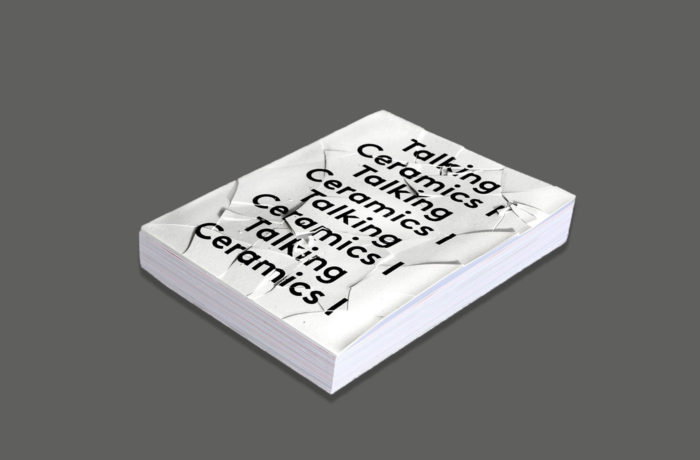
To experience this excitement, anxiety and surprise, the reader must literally bake the white book in an oven – watch and wait – all is revealed as the heat transforms the cover and reveals the design.

Taking Ceramics I discusses the topic of mistakes with several past artists-in-residence from the European Centre of Ceramics’ (EKWC) . Playing with the subject, the book’s layout emphasises fragility, splitting content over pages and positioning it precariously close to the edges.

The special edition furthers this theme with its 1mm thick porcelain cover. Inevitably, whether through the sheer weight of other books or mishandling the cover will crack. The reader, like the ceramicist, learns to accept and appreciate the beauty of mistakes.


Trapped in Suburbia award

Gold | 2017 European Design Awards
Bronze | 2017 European Design Awards
Nomination | 2017 ADCN Awards